October 13, 2026
Why Pixel Fonts. The Honest Answer Is Less Interesting Than You'd Think.
No dramatic origin story, no calling. Just why pixel fonts became the one thing at Phoenix Dungeon worth building around, and why that's enough.
I want to be upfront about something before this piece goes anywhere.
There is no dramatic origin story here. No specific moment where I looked at a pixel font and felt something shift inside me. No childhood memory of playing games on a tiny screen that I can trace back to as the reason. No romantic narrative about being called to this particular form.
I just like how they look. That's the whole story.
I know that's not the answer most people expect. We're used to creative people having a mythology around their choices, a story that explains why this and not something else. I don't have that. And I've decided I'm more interested in being honest about it than in building a mythology that sounds better than the truth.
The Practical Reason First
Before the personal part, there's a cleaner explanation for why pixel fonts make sense as a focus, and it's worth saying clearly.
Script fonts are everywhere. If you've spent any time on a font marketplace in the last five years, you know this. Romance scripts, brush scripts, signature scripts, handwritten scripts. The category is so full that releasing a new one means competing against thousands of existing options, many of which already have the sales history and platform momentum that gets them recommended first. It's the same problem we wrote about when we talked about why Phoenix Dungeon lost the last round. Entering a saturated category late is not a strategy, it's just hoping.
Display fonts are different. They have character. They make a statement. They're chosen intentionally, not because they fit a general brief, but because they carry a specific attitude that the designer wants the work to carry. The right display font isn't interchangeable with another display font the way one clean serif can often substitute for another.
Pixel fonts sit in an interesting position between these two things. They're not saturated the way scripts are. Most of what exists in this category is either low-effort pixel art throwaway fonts, or fonts buried in the back catalog of general foundries that made them as a side experiment. The category doesn't have many studios treating it as the main event.
And they have the specificity of display. When someone chooses a pixel font, they're not choosing it because it was the closest match to a vague requirement. They're choosing it because they wanted exactly that. The purchase is intentional. The search that led to it was intentional. Nobody stumbles into buying a pixel font by accident.
That matters more than it sounds like it does.
The Niche Insight That Actually Changed How I Think
I spent a long time believing that broader reach was better. More categories, more options, more types of designers served. Cast a wider net and catch more fish.
What I didn't understand is that a wide net in a crowded ocean mostly catches nothing. Because everyone else is also casting wide nets and the fish have too many options to pay attention to any single one.
A narrow net in a specific place, a place where fewer people are fishing and the ones looking are looking for exactly what you have, that's a different situation entirely.
The people who search for pixel fonts are not browsing. They already know what they want. They have a project that needs this specific visual language and they're looking for the version that does it best. If Phoenix Dungeon is there, and the work is good, the sale is not an accident. It's the conclusion of an intentional search.
That's the kind of customer I want. Not someone who lands on a font because the algorithm happened to surface it next to something else. Someone who came looking and found what they were looking for.
The Genuinely Boring Personal Reason
Okay. Here's the actual personal part, and I'm going to say it plainly because I already promised not to dramatize it.
I like making pixel fonts more than I like making anything else.
Not because of a feeling. Not because of a story. Just because when I'm working on one, the time moves differently than when I'm working on a script or a serif. The constraints of the grid are interesting to me in a way that the constraints of other categories aren't. The decisions are different. What you can do with a limited number of pixels and still have something feel like a specific letter, a specific personality, a specific attitude, that problem is genuinely fun for me to sit with.
I'm not going to oversell that. It's not a calling. It's a preference. But preference is actually enough of a reason to base a creative practice around something, maybe more than enough.
There's a version of this story where I tell you that pixel fonts chose me, that the grid called to me, that every pixel placed feels like a small act of intention in a world that moves too fast. That version sounds better. It would probably perform better on the internet. But it would also be completely made up, and I've already spent enough time in Phoenix Dungeon's history doing things for the wrong reasons.
The truth is simpler and I think more durable. I sit down to make a pixel font and I don't watch the clock. That's it. That's the whole personal reason. The work absorbs me in a way that other categories don't, and I've learned to trust that signal more than I trust any amount of strategic reasoning about what I should be making.
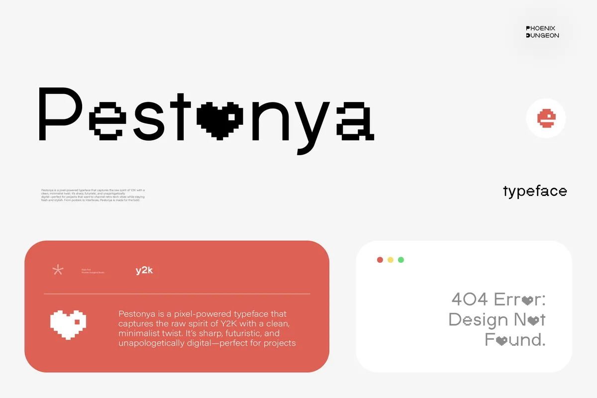
The fonts I've made in this direction, Udeyna, Arteche, Pestonya, they came from a place of genuine interest in the problem. That's different from the fonts I made during the stretch when I was producing twenty-five a month. Those came from a place of wanting the output to exist. These come from a place of wanting to figure something out.
The difference shows up in the work. I think it always does.
The Rule I Made for Myself
At some point during all of this, something shifted in how I think about Phoenix Dungeon.
I have other things now. A SaaS business that actually pays the bills. A design studio with real clients. I'm not relying on font sales to survive the month. That changes the relationship you can have with a creative project in a way that's hard to fully explain until you've been on both sides of it.
When I needed Phoenix Dungeon to perform, it had to be a business first and a creative project second. Every decision had to be filtered through whether it would move the numbers. That's not a bad way to run a business, but it's a difficult way to make good work, because the question of whether something is good and the question of whether something will sell are not always the same question.
Now I've given myself permission to not care about the second question.
The rule is simple: I make what I want to make, the way I want to make it, and I put it out there. If it sells, I'm glad. If it doesn't, I made something I'm proud of and that's its own reward. Phoenix Dungeon is no longer trying to be my primary income. It's trying to be something I'm proud to have built.
That's a different kind of pressure. Lighter in some ways, heavier in others. Lighter because no single font has to carry the weight of the whole operation. Heavier because now the only standard I'm holding myself to is my own, and my own standards are harder to negotiate with than a sales dashboard.
What I Actually Want for Phoenix Dungeon
I want it to be known as the pixel font studio.
Not one of them. The one. The name that comes up when someone who cares about this category asks for a recommendation. The catalog that a designer bookmarks because they know that when they need a pixel font that actually does something, this is where they'll find it.
I don't know if that happens. I can't guarantee it. But I know it's a thing worth building toward, and I know I'd be genuinely proud if it got there. Not manufactured proud, not "I achieved the goal I set" proud. Actually proud. The kind that comes from spending real time on something you care about and having it become something real.
That's what pixel fonts are for me. Not a dramatic decision. Not a calling. Just the thing I'm most interested in making, in a space that actually has room for someone who takes it seriously.
Simple as that.
Related Articles
All articlesOct 9, 2026Y2K
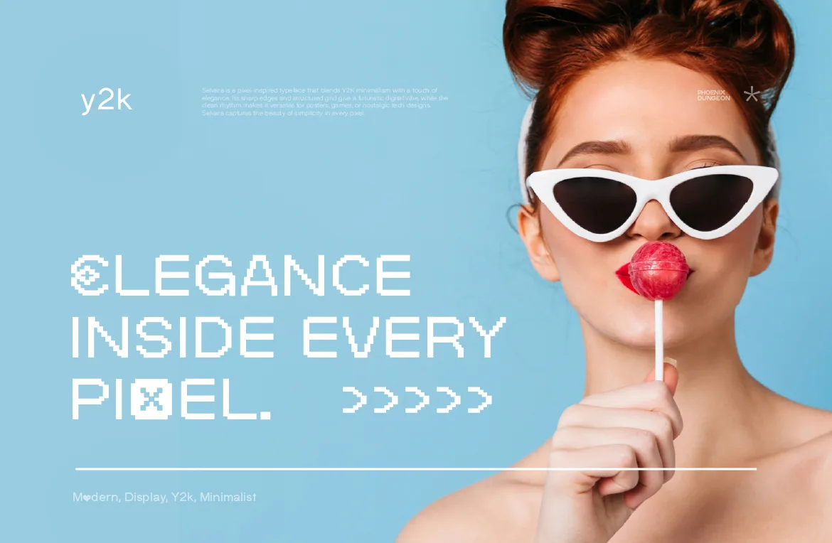
Y2K Fonts: How to Use Pixel Type for a Y2K Look
Y2K design borrows more from early interfaces than from pixels alone. Here's how to use pixel type for a Y2K look that feels current, not like a costume.
Read more
Oct 6, 2026Founder Story
I Made a Font Every Day for a Year. Here's What It Did to Me.
Twenty-five fonts a month through 2023 and 2024, including one named after the woman I love that never sold. What that stretch of daily font-making did to me.
Read more
Oct 2, 2026Licensing
Pixel Font Licenses Explained: Which License Do You Actually Need?
Desktop, Web Font, Merchandise, App and more: our nine license tiers explained in plain English, so you buy the one you need and nothing you don't.
Read more