October 9, 2026
Y2K Fonts: How to Use Pixel Type for a Y2K Look
Y2K design borrows more from early interfaces than from pixels alone. Here's how to use pixel type for a Y2K look that feels current, not like a costume.
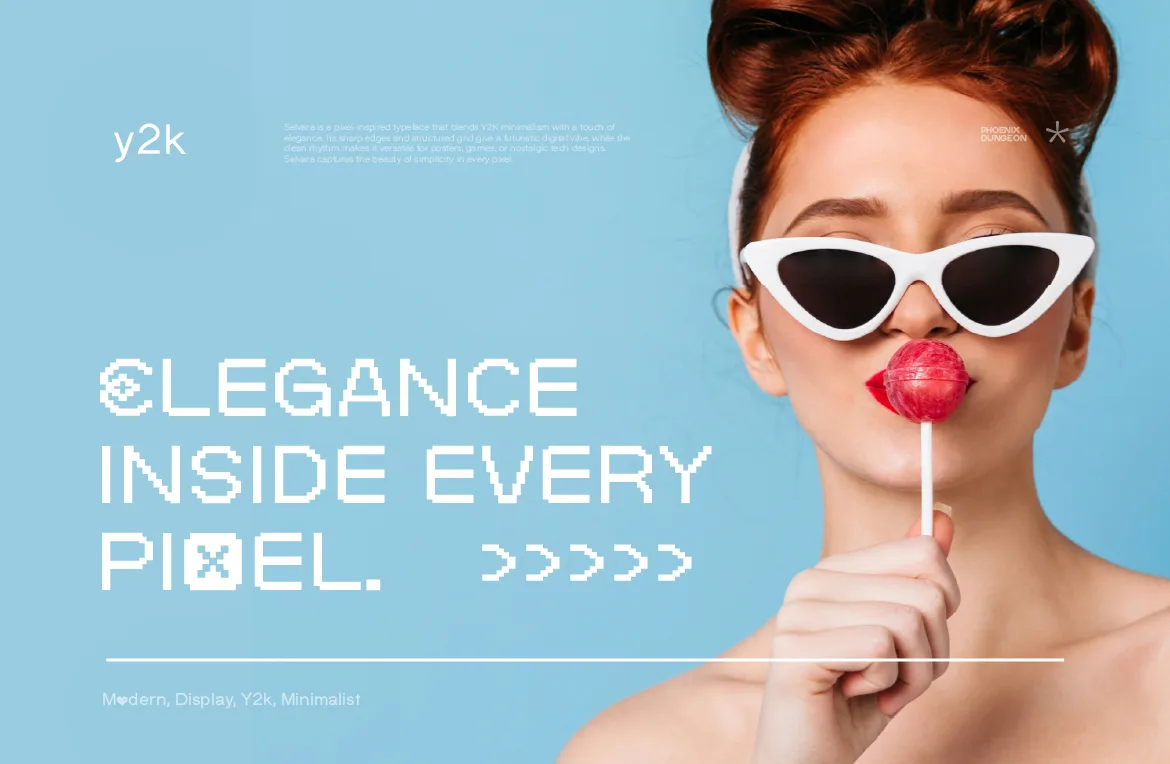
Y2K design is back, and it's showing up everywhere: fashion drops, album covers, indie games, app branding, even furniture. But there's a version of the Y2K look that feels current and a version that feels like a costume party, and the difference often comes down to one decision: the typeface.
This guide breaks down what the Y2K aesthetic actually is, why pixel type fits it so well, and how to use pixel fonts for a Y2K look that feels intentional instead of nostalgic for nostalgia's sake.
What "Y2K Aesthetic" Actually Means
The name comes from "Year 2000," the date that worried everyone about computers failing at midnight. As a design mood, it covers roughly the late 1990s to the early 2000s, a period when the internet was new, technology looked like the future, and most people believed the future would be shiny.
The visual ingredients are easy to list: translucent plastics and glossy gradients, chrome and metallic finishes, bubbly shapes, early-web layouts, cyber and space motifs, and interfaces that looked like software from the time. It's an optimistic, slightly awkward version of "the future," and that awkwardness is a big part of the charm.
What's often forgotten is the type. A lot of Y2K design was built around the fonts computers themselves used: small screen fonts, bitmap-style interface text, techno display faces. That is exactly why pixel type sits so naturally inside this look.
Why Pixel Fonts Fit Y2K So Well
Pixel fonts were, at one point, simply how screens showed text. Early operating systems, handheld devices and websites relied on letterforms built from a grid because that's what the hardware could draw. So when a designer uses pixel type today, it carries a real connection to the era, not just a surface imitation of it.
There's a second reason. Y2K design is about the tension between "high tech" and "handmade in a hurry." A pixel font holds both at once: it's rigid and digital, but each shape is visibly drawn by a person making choices on a grid. That contrast is what makes it feel more alive than a generic futuristic sans-serif.
We covered the broader idea in the story behind rebuilding Phoenix Dungeon around pixel type: this aesthetic sits at the intersection of nostalgia and edge, and that is a specific place, not a vague one.
The Costume Party Problem
Here's where Y2K work goes wrong. A designer grabs every trope at once: chrome text, lens flares, a butterfly clip-art, a starry gradient, and a default pixel font from the first free-font page they found. The result looks like a reference sheet, not a brand.
The fix is restraint. Choose one or two Y2K signals and let them do the work. If the type is the signal, keep the rest of the layout clean. If the imagery is doing the heavy lifting, use the type quietly. Y2K done well feels curated; Y2K done badly feels like a checklist.
The typeface is where that restraint is easiest to apply, because a well-chosen font carries the whole era with a single decision.
Three Pixel Fonts for Three Kinds of Y2K
Not every Y2K project wants the same mood. Here's how we'd match our own fonts to different directions.
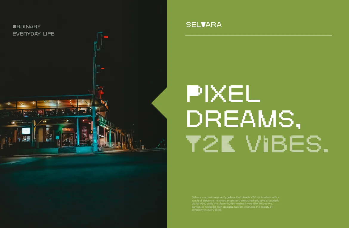
Soft and nostalgic: Selvara. A blocky pixel display face with a soft Y2K edge, clean grid construction and a few playful glyph quirks. It's built for tech branding, posters and nostalgic interface-inspired work. If your project should feel like a friendly piece of early software, this is the closest match.
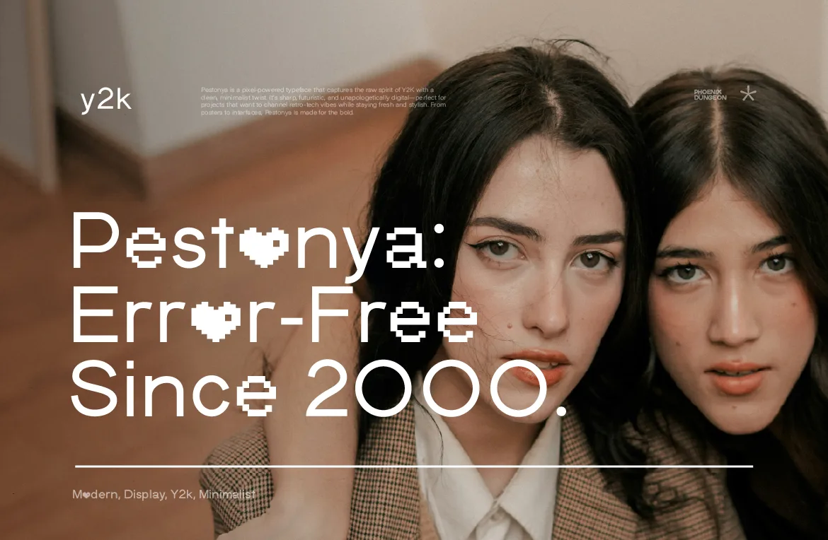
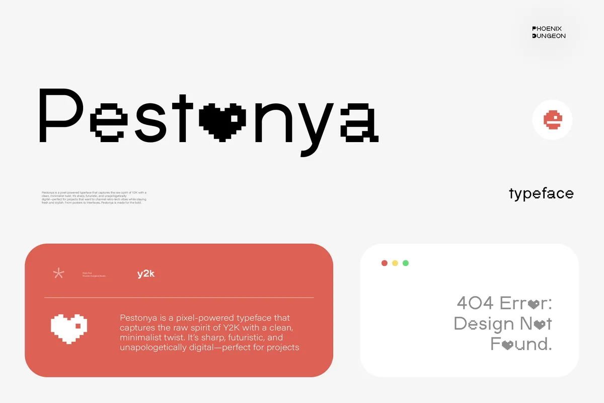
Sharp and futuristic: Pestonya. A pixel display face with four full weights, from clean Regular to punchy Bold Italic, and a sharp, futuristic edge. It's the one to pick when Y2K to you means "cyber" rather than "cute," and when you need a hierarchy of weights across a full system.
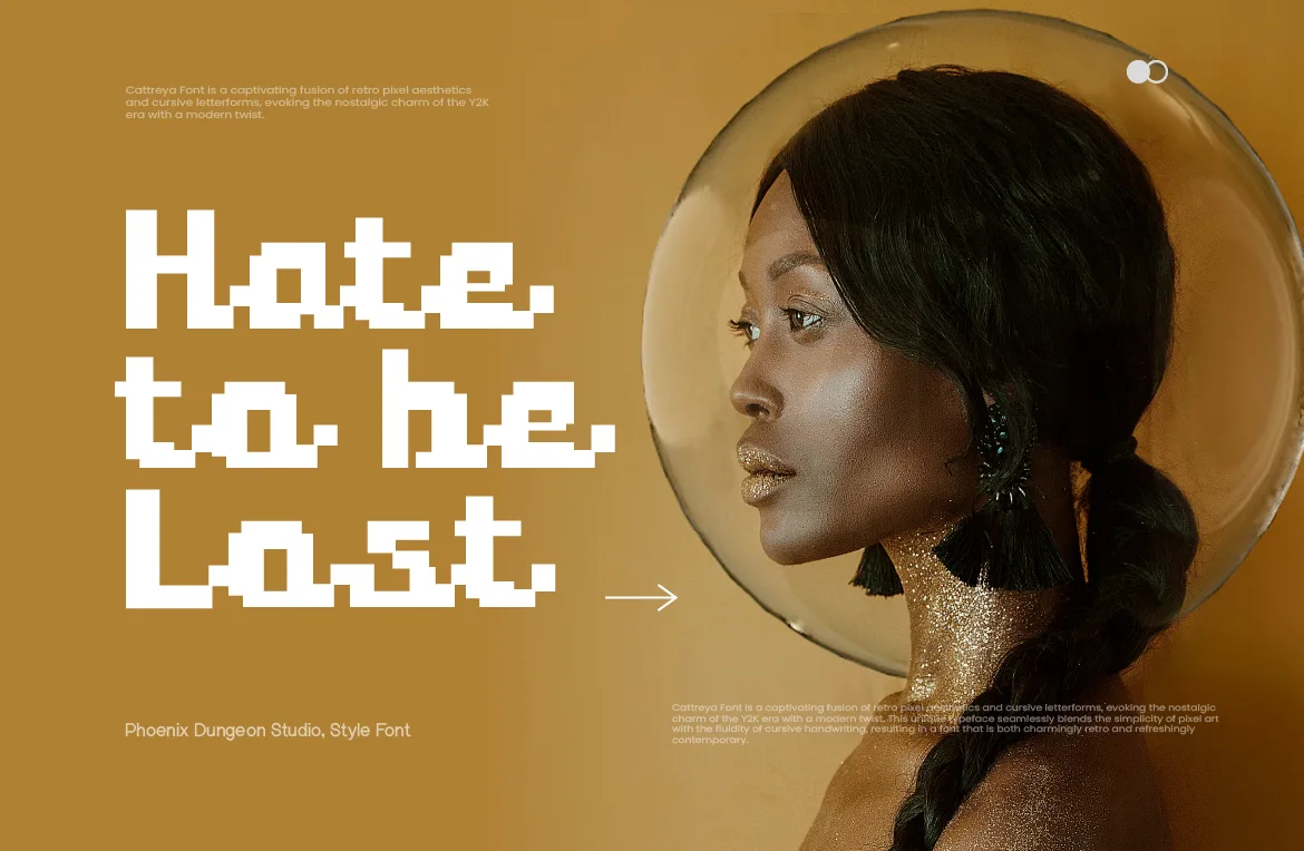
Blocky with a twist: Cattreya. A pixel typeface that pairs blocky construction with flowing, connected letterforms. It has a more personal, almost handwritten feeling than most pixel faces, which suits Y2K projects leaning toward diary-page, fashion or music aesthetics.
How to Use Pixel Type in a Y2K Layout
Use it for the loudest thing on the page. Pixel type shines at display sizes. Put it on the headline, the logo, the poster title or the album name. Let a calmer typeface handle the long reading.
Match sizes to the grid. Pixel fonts look crispest when they are set at sizes that are multiples of the size they were designed on. Stray sizes can make edges look soft or uneven. If a headline looks slightly blurry, adjust the size rather than the effect.
Keep the palette purposeful. Y2K color is famous for icy blues, silvers, lilac and acid greens, but a single strong color on a clean background often reads as more confident than a full rainbow gradient.
Don't over-effect it. A pixel font already has texture. Adding a heavy outline, a glow and a bevel on top usually muddies the very grid that makes it interesting. Add one effect at a time and stop when it looks finished.
Give it room. Y2K layouts can feel busy, but the type itself needs breathing space. Generous spacing around pixel headlines keeps the letterforms legible and helps the design feel modern rather than cluttered.
Building a Simple Y2K Type System
A good Y2K project rarely uses type at random. It follows a small system, and that system can be surprisingly short.
One expressive font. This is your Y2K voice: the pixel display face on the logo, the headlines and the key graphics. Pick it first, because everything else is built around it.
One calm companion. A clean, readable typeface for anything longer than a line or two. This can be a neutral sans-serif or a simple mono. Its job is to stay out of the way so the expressive font can stand out.
One accent rule. Decide what gets the special treatment, for example only the first word of a headline, or only prices and dates, and stick to it. Consistent accents make a layout feel designed instead of decorated.
With that structure in place, the Y2K feeling comes from the choices you make, not from piling on effects. It also makes the project easier to extend: a new poster, a new social template or a new page all follow the same three rules.
Mistakes That Make Y2K Work Look Dated Instead of Retro
Copying instead of referencing. Nostalgia works best when it's a reference filtered through a current eye. If a layout could have been made in 2002 without changing anything, it probably reads as old rather than retro.
Using the era's worst habits. Low-contrast text on busy backgrounds and tiny unreadable labels were flaws in the original designs. You don't need to reproduce them to evoke the era.
Mixing too many typefaces. Y2K layouts often used a lot of fonts. A modern version feels sharper with two, one expressive and one calm.
Ignoring the audience. Some viewers remember this period and some only know it as a style. Design so it reads clearly to both, without needing the backstory.
Where Y2K Pixel Type Works Best
Fashion and streetwear. Retro-digital graphics on hoodies and tees are a natural fit, as long as the font isn't one everyone has already seen. We looked at that specific case in our streetwear guide.
Music and events. Album art, gig posters and festival branding benefit from a typeface that signals a mood before anyone reads a word.
Tech and app branding. A pixel wordmark can give a product a friendly, retro-tech personality that a neutral sans-serif can't.
Editorial and social. Covers, story templates and thumbnails can use a pixel headline as an instantly recognizable signature.
Frequently Asked Questions
Are pixel fonts the same thing as Y2K fonts?
Not exactly. Pixel fonts are a construction style, built on a grid. Y2K is a design era. Many Y2K projects use pixel fonts, but pixel fonts also work in gaming, streetwear, editorial and plenty of other contexts.
Will a Y2K look go out of style?
Trends cycle, but the parts that endure are the ones rooted in real history. Pixel type has been part of screen culture for decades, which gives it more staying power than a purely decorative effect.
Can I use a Y2K pixel font for commercial work?
Yes, with the right license. Client work, logos, merchandise and apps each need a specific tier. Our license page explains the terms, and every font page lists the exact rights and price for each tier.
Should I mix a pixel font with another typeface?
Usually, yes. Pixel type is at its best in short, prominent text. Pairing it with a clean, readable face for paragraphs keeps the whole layout comfortable to read.
The Short Version
Y2K works when it's specific. Pick the mood first, soft, sharp or personal, then choose the pixel font that carries it, and let the rest of the design stay quiet. If you want to see the options side by side, the full catalog is the place to start.
Related Articles
All articlesOct 2, 2026Licensing
Pixel Font Licenses Explained: Which License Do You Actually Need?
Desktop, Web Font, Merchandise, App and more: our nine license tiers explained in plain English, so you buy the one you need and nothing you don't.
Read more
Sep 25, 2026Pixel Fonts

Pixel Fonts for Streetwear Branding: How to Choose One That Doesn't Look Cliché
Pixel fonts and streetwear are a natural match, but the wrong one reads as a costume, not a brand. Here's how to pick a pixel font that actually holds up on merch.
Read more
Sep 22, 2026Rebrand

150 Fonts, No Identity: The Honest Story of Why Phoenix Dungeon Is Starting Over
Phoenix Dungeon once had 150 fonts and no identity. Here's the honest story of why we tore it down and rebuilt around pixel fonts only.
Read more