September 25, 2026
Pixel Fonts for Streetwear Branding: How to Choose One That Doesn't Look Cliché
Pixel fonts and streetwear are a natural match, but the wrong one reads as a costume, not a brand. Here's how to pick a pixel font that actually holds up on merch.
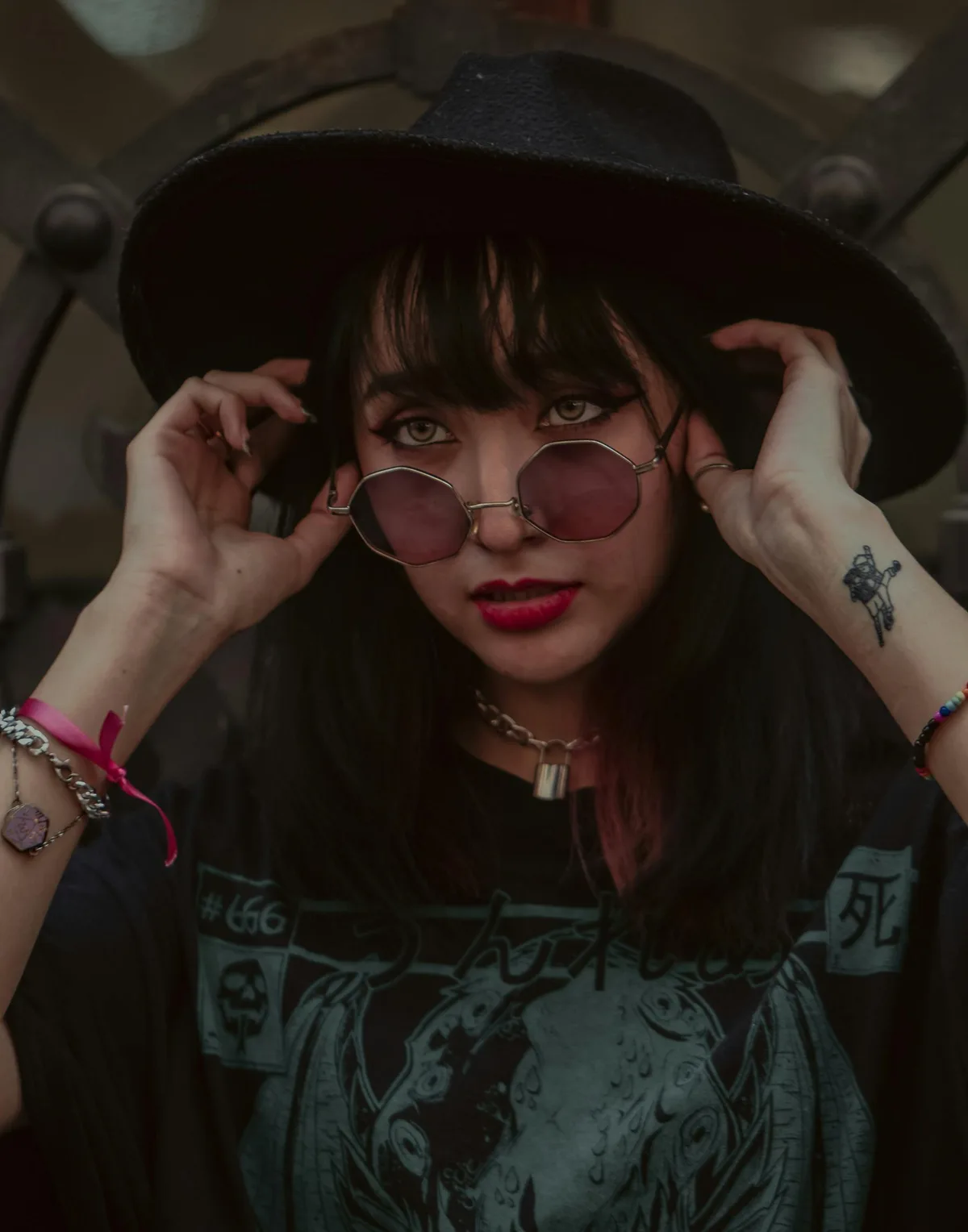
A pixel font on a hoodie can look like the label spent real time on its identity. Or it can look like a fan account made the drop in an afternoon. The difference isn't the grid. It's which pixel font you picked and why.
Streetwear and pixel fonts already belong together, the same way script fonts ended up on cargo pants nobody expected them on. The tension between a rigid digital grid and a rough, physical garment is exactly what makes the combination work. But "pixel font" is not one thing. It's a category with a huge range, from throwaway 8-bit throwbacks to genuinely considered display type. Picking the wrong end of that range is how a drop ends up looking like merch for a game that doesn't exist.
Here's how to tell the difference before you commit a font to a print run.
Why Streetwear Reaches for Pixel Fonts in the First Place
Streetwear identity runs on contrast. Soft materials, hard graphics. Expensive production, deliberately rough presentation. A pixel font fits that logic immediately: it's built on a strict digital grid, but it carries the texture of something handmade, low-fi, slightly broken. Next to a clean garment, that contrast reads as intentional rather than accidental.
There's also a legibility argument that gets missed. Because every pixel in a well-made font is a deliberate decision inside a tight constraint, these typefaces tend to stay clear at the small sizes labels actually need: woven tags, care labels, a chest logo shot from ten feet away on a phone camera. A fragile script or an overly ornamental display font can fall apart at those sizes. A solid pixel font usually doesn't.
The Cliché Trap: When a Pixel Font Reads as Costume, Not Brand
Here's where most streetwear pixel-font usage goes wrong, and it's worth naming directly.
The most recognizable pixel fonts online are also the most overused: the default "arcade" look, the exact bitmap style lifted straight from an 8-bit console font, used with zero modification. The moment a customer's brain files your logo under "that's the font from every free-font roundup," you've lost the thing you were trying to buy: a distinct identity.
Three signs a pixel font is going to read as costume instead of brand:
1. It's a free font you've already seen on ten other drops. If it shows up on the front page of a "50 free pixel fonts" roundup, assume every teenager with a design app has already used it.
2. It's expected to do every job. A single heavy weight can be perfect for a hero print. But if it's the only font in the system, the logo, the hangtag and the size label all end up in the same visual register, and the brand has no hierarchy.
3. It's literally a game font, unmodified. There's a difference between a typeface that's inspired by early computing and one that's just a ripped console font. Customers can feel the difference even if they can't name it.
None of this means avoid pixel fonts. It means avoid the obvious ones.
What Separates a Serious Pixel Font From a Gimmick
A pixel font built for actual brand use, not just novelty, tends to have a few things a throwaway one doesn't:
Range inside the family. A hero logotype needs weight and presence. A care label needs a lighter, tighter version of the same DNA. If you only have one flavor, you'll end up mixing it with an unrelated typeface for secondary text, and the system starts to fall apart. This is the whole point of a font like Pestonya, which ships with four full weights from clean Regular to punchy Bold Italic: enough range to carry a hero print, a hangtag and a size label from the same family without switching typefaces halfway through the system.
A complete, considered character set. Streetwear packaging touches more than a logo: batch numbers, drop dates, size charts, sometimes multiple languages if you're selling internationally. A font with gaps in its numerals, punctuation or accented characters will break the moment production needs something the designer didn't plan for. Test the exact strings you'll print before you buy.
Internal consistency at the pixel level. This is the part that's hard to fake. In a well-built pixel font, every letter comes from the same underlying grid logic: same stroke width, same corner treatment, same rhythm. A font like Cattreya is a good stress test for this idea. It fuses blocky pixel construction with flowing, connected letterforms, which is a much harder system to hold together than a plain block face. When it works, the whole word still reads as one voice instead of two typefaces fighting each other. You can run the same check on anything you're considering: set a full sentence and see whether it feels designed or assembled.
A license that actually covers merch. This is the boring part nobody wants to think about until a legal team asks for it. Plenty of "free for personal use" pixel fonts are not cleared for a product you're selling. Before a font goes anywhere near a print run, confirm the license explicitly covers physical merchandise, not just digital mockups. At Phoenix Dungeon that's the Merchandise & Print tier, which also includes logo use and everything below it. The general terms are on our license page, and the exact rights and price for each tier are shown on every font's page.
Matching the Font to the Job
Not every application on a garment needs the same font weight or style. A quick way to think about it, placement by placement:
Hero logo / chest print. Go bold and unmissable. This is the one placement where the pixel grid should be loud. Arteche is built for exactly this: one heavy 8-bit weight designed for arcade energy and maximum impact. It's a display face, not something you'd ever mistake for body copy, so pair it with a companion for everything else.
Secondary graphics / back print / drop copy. Something with a bit more flexibility but still clearly from the same visual world. Overy works here: a chunky, rounded pixel face that comes in Regular and Italic, so drop copy can stay in one register and shift to Italic for emphasis without borrowing an unrelated typeface.
Full brand rollout across many touchpoints. Logo, hangtags, lookbook, size chart, website. This is where a single-weight novelty font falls apart fastest. Pestonya's four weights are built for exactly this kind of system-wide consistency.
Y2K-leaning drops. If the collection is already pulling from early-2000s references, lean into it fully rather than half-committing. Selvara is built for that territory: a blocky grid with a soft Y2K edge and a few playful glyph quirks, made for nostalgic, interface-inspired branding.
Playful, youth-leaning, skate-adjacent drops. Not every streetwear brand wants to look tough. Udeyna leans into rounded, distinctive shapes and a fun digital voice, which reads closer to app branding and game interfaces than hard graphic tees. That's useful when the brand's whole point is not taking itself too seriously.
Picking one font and forcing it into every placement is usually the tell that a brand didn't think about hierarchy. Picking a small set of fonts that share the same underlying logic is what makes a drop feel designed rather than assembled.
A Quick Checklist Before You Commit
Before locking a pixel font into a print run or a brand guideline, run it through this:
— Does the system have more than one weight, or a companion style, for secondary text?
— Have you seen this exact font on someone else's drop in the last year? If yes, reconsider.
— Does the license explicitly cover physical merchandise, not just digital use?
— Does it hold up at the smallest size you'll actually print it, meaning a size tag and not just a hero banner?
— Does a full word or sentence in this font look like one coherent voice, or like mismatched letters stitched together?
— Does it include every character your production files actually need, from numerals to accents?
If a font fails more than one of these, it's probably a placeholder, not a brand asset.
Frequently Asked Questions
Is a pixel font actually good for streetwear branding, or is it just a trend?
It works because the contrast is structural, not decorative. Streetwear already runs on tension between rough presentation and deliberate design choices, and a well-built pixel font brings exactly that tension to a logo or print. The trend cycles; the underlying contrast doesn't.
What's the difference between a "retro gaming" font and a pixel font built for branding?
A retro gaming font is usually a direct reference to a specific console or game era, often copied from one. A pixel font built for branding borrows the grid-based construction but is drawn as its own typeface, with a considered character set, real range, and a license meant for commercial products rather than fan projects.
Do I need a special license to print a pixel font on clothing?
Yes, in most cases. A license that only covers personal or desktop use does not extend to physical merchandise you sell. Check the specific terms before a font goes into production, not after the print run is already at the factory. Phoenix Dungeon's Merchandise & Print tier covers physical products and print for sale, such as t-shirts, posters and packaging.
Can I mix more than one pixel font in the same collection?
Carefully, yes. The safest approach is picking fonts that share a similar grid logic or come from the same foundry's catalog, so the weight and construction feel related even when the individual letterforms differ. Mixing an 8-bit arcade face with a soft, rounded pixel face in the same drop without a clear hierarchy is usually where it starts to look accidental instead of intentional.
Where to Start
Phoenix Dungeon builds pixel fonts as the primary focus, not a side experiment bolted onto a broader catalog. If you want the reasoning behind that decision, it's in the story of why we rebuilt the studio around pixel type. If you're building a drop and need something with an actual point of view instead of a font everyone's already seen, Arteche for hero impact, Pestonya for a full multi-weight system and Selvara for anything Y2K are the three easiest entry points.
Browse the full catalog in the fonts shop before your next drop goes to print.