October 23, 2026
When to Use a Pixel Font (and When Not To)
Pixel fonts are powerful and easy to misuse. A straight-talking guide to when a pixel font is the right call, and when another typeface will serve you better.
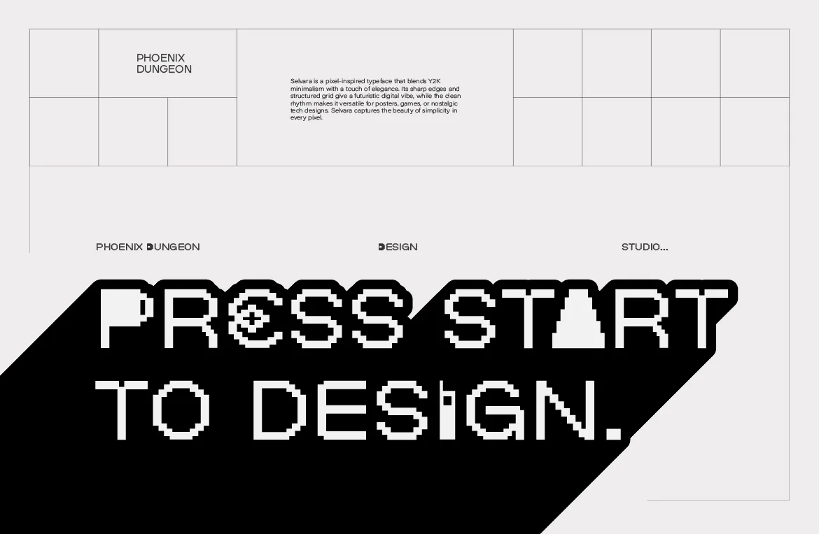
Pixel fonts are one of the most recognizable kinds of type, and one of the easiest to misuse. Used well, they give a design a voice that no neutral sans-serif can match. Used in the wrong place, they make a page harder to read and a brand look like it's cosplaying an era.
Since we make nothing but pixel fonts, you might expect us to say "use them everywhere." We won't. This guide is a straight answer to a question designers ask often: when is a pixel font the right call, and when should you choose something else?
The Short Rule
Use a pixel font when the design needs attitude in a short amount of text. Avoid it when the design needs comfort across a long amount of text.
Almost every good and bad pixel font decision follows from that one distinction. Pixel type is expressive at headline size and demanding at paragraph size. Keep that in mind and most of the rest is detail.
When a Pixel Font Is the Right Call
The brand is connected to games, tech or early digital culture. If your audience grew up with consoles, arcades or early computers, or your product lives on a screen, a pixel font is an honest fit, not a costume.
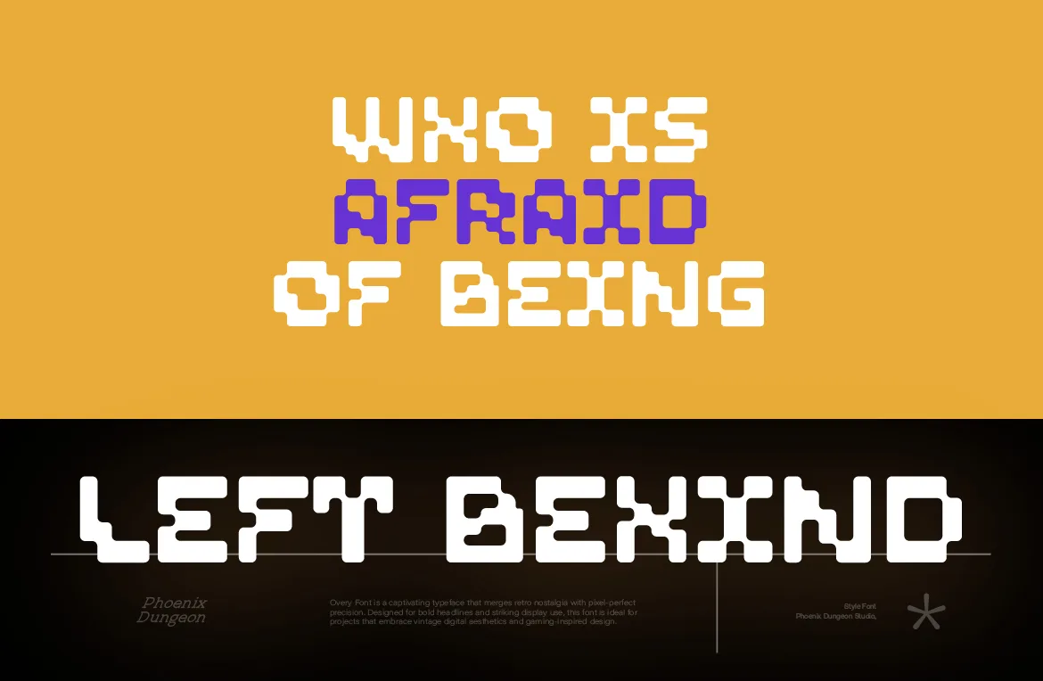
You need a memorable wordmark. A well-built pixel font gives a logo a distinctive silhouette. Because these typefaces are specific, they're rarely mistaken for anything else, which helps a brand stand out in a crowded feed.
The text is short and prominent. Titles, headlines, posters, packaging fronts, album covers, event names and interface labels are all places where a pixel font can shine.
The design wants contrast. Pixel type against clean photography, soft materials or calm layouts creates a tension that reads as intentional. This is a big part of why the style works in fashion, as we explored in our streetwear guide.
You're leaning into a Y2K or retro-digital mood. If nostalgia is the point, pixel type carries it with one decision. We covered that in our Y2K font guide.
You're building a game or app with a retro personality. Matching the type to the art helps everything feel cohesive.
When You Should Probably Choose Something Else
Long-form reading. Articles, reports, terms and conditions, instruction manuals and any text a person needs to read for more than a few lines belong in a typeface designed for reading. Pixel fonts are built on a grid that makes letters distinct at display sizes but tiring in long paragraphs.
Very small text on uncontrolled screens. Pixel fonts look their best at sizes that match their grid. On screens where you can't control scaling, tiny pixel text can render unevenly. If you can't test it, don't rely on it.
Safety, medical and legal information. When misreading something has real consequences, choose the most readable typeface you can. Personality is not the priority here.
A brand that needs to feel timeless, formal or quiet. A law firm, a funeral service or a heritage brand asking for calm authority will usually be better served by a different kind of typeface. A pixel font would send the wrong signal, however good it looks.
Because everyone else is doing it. Following a trend without a reason is how brands end up looking interchangeable. If you can't say why pixel type fits this project, it probably doesn't.
Three Real-World Situations
Rules are easier to apply with examples, so here are three common briefs and how we'd think about each.
A coffee brand that wants to feel playful. The packaging front has a name and a short tagline, and the audience is young and online. A pixel font on the front is a strong choice: short text, high attitude and a clear personality. The ingredients, brewing notes and legal copy on the back should switch to a readable typeface. The pixel font gets the memorable moment and the conventional font does the informing.
A financial advice website. The whole product is trust and clarity, and most of the content is long explanations that people need to understand. A pixel font for the logo might work if the brand really has a digital-native, playful personality, but using it for the articles would be a mistake. Here the safest answer is a pixel wordmark at most, and a highly readable typeface everywhere else.
An indie game studio's landing page. The brand is the game, the audience knows the aesthetic, and the page is mostly headlines, screenshots and a few short descriptions. This is where pixel type is at home. Keep the pixel font on the headlines and buttons, use a calm typeface for the longer description and the result feels cohesive without being tiring.
In each case the decision wasn't "do we like pixel fonts?" It was "what is each piece of text doing, and how long is it?" That question is more useful than any style preference.
What to Use Instead When a Pixel Font Isn't Right
If you've decided a pixel font isn't the right choice for a piece of text, you can still keep some of the same personality in other ways.
A geometric or grotesque sans-serif gives a clean, modern, slightly technical feeling and reads well at any length. It's a good default when you want clarity with a bit of edge.
A monospaced typeface carries a hint of computing history without the strict pixel grid. It works well for labels, captions and short technical text.
A pixel font used sparingly is another option. Even in a design that mostly uses another typeface, a single pixel-set word, a date or a price can act as a signature detail. The rest of the text stays comfortable, and the pixel type becomes an accent instead of the main voice.
Choosing not to use a pixel font in a given place isn't a rejection of the style. It's the same judgment that makes pixel type look confident everywhere you do use it.
A Quick Decision Test
Ask yourself these questions before choosing a pixel font:
— Is most of the text short and prominent?
— Does the brand or audience have a real connection to games, tech or retro-digital culture?
— Can I pair it with a readable typeface for anything longer than a headline?
— Can I control the size and scaling well enough for the grid to stay sharp?
— Would I still be happy with this choice if the trend moved on?
If most answers are yes, a pixel font is likely a strong choice. If several are no, look at other options.
How to Get the Best Out of Pixel Type When You Do Use It
Pair it with a calm partner. Let the pixel font handle headlines and labels, and use a clean, readable typeface for body copy. The contrast makes both work harder.
Pick a font with range. Systems that need hierarchy benefit from a family with several weights. Pestonya is a good example, with four full weights from Regular to Bold Italic.
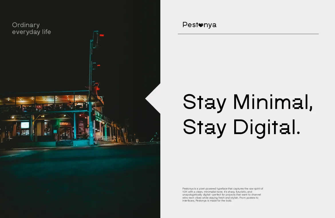
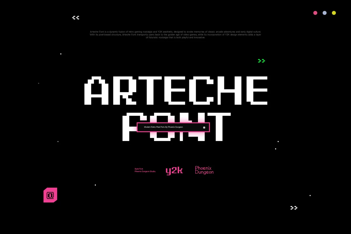
Choose the right personality for the job. For bold titles, Arteche brings a heavy 8-bit weight and arcade energy. For a friendlier, rounder voice, Udeyna leans playful and digital. For a Y2K mood, Selvara has a soft Y2K edge and nostalgic interface charm.

Give it space. Pixel letterforms are dense. Generous margins and line spacing help them breathe.
Keep effects minimal. The grid is already the texture. Extra glows, bevels and outlines usually fight it.
Frequently Asked Questions
Can I use a pixel font for body text?
It's rarely a good idea for anything beyond a few lines. If you must, use a pixel font that's designed for small text, set it at a size that matches its grid, and test it on the screens your readers will use.
Are pixel fonts only for gaming?
No. They started in computing and gaming, but they now appear in fashion, music, editorial design, product branding and event graphics. We wrote about how the style has worked in very different contexts across eras in why pixel fonts have always fit everywhere.
Do pixel fonts look unprofessional?
Not inherently. A carefully made pixel font used with intention looks deliberate. The unprofessional look comes from overused free fonts, poor pairing and too many effects.
How do I know if a pixel font is high quality?
Set a full sentence. If the letters feel like they come from one consistent system, with even spacing and a clear grid logic, it's well made. Also check the character set, the available weights and the license before you commit.
The Short Version
Pixel fonts are for attitude in short, prominent text. They're not for long reading, safety-critical information or brands that need to feel quiet. Pair them with a calm typeface, choose one that fits the job, and you get all of the character with none of the strain. When you're ready to look, the full catalog is here.
Related Articles
All articlesOct 20, 2026Pixel Fonts
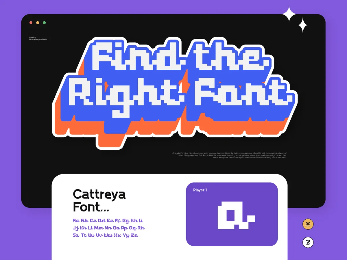
Pixel Fonts Have Always Fit Everywhere. Designers Just Forgot to Notice.
From government interfaces to streetwear lookbooks, pixel fonts have done a different job in every era. Why the category fits more than its reputation suggests.
Read more
Oct 16, 2026Game Design
Pixel Fonts for Indie Game UI: What Actually Stays Readable
Pixel type can make a game interface feel cohesive or quietly unusable. What keeps menus, dialogue and HUDs readable, and which license covers a shipped game.
Read more
Oct 13, 2026Pixel Fonts

Why Pixel Fonts. The Honest Answer Is Less Interesting Than You'd Think.
No dramatic origin story, no calling. Just why pixel fonts became the one thing at Phoenix Dungeon worth building around, and why that's enough.
Read more