October 16, 2026
Pixel Fonts for Indie Game UI: What Actually Stays Readable
Pixel type can make a game interface feel cohesive or quietly unusable. What keeps menus, dialogue and HUDs readable, and which license covers a shipped game.
A pixel font seems like the obvious choice for an indie game. It matches the art, it feels right for the genre, and players recognize it instantly. Then the first playtest happens and someone says the shop menu is hard to read, the dialogue box gives them a headache, and the health numbers blur together on a TV.
Pixel type can make a game interface feel cohesive, or it can quietly make it unusable. This guide covers what keeps pixel fonts readable in menus, dialogue, HUDs and titles, how to choose between fonts for different jobs, and which license you need before you ship.
Why Pixel Fonts and Games Belong Together
Pixel fonts grew up alongside games. Early hardware could only draw letters as small grids of squares, so the text in games looked like that by necessity. Today it's a choice, and it's a strong one: a pixel font tells the player, before a single word is read, what kind of world they've entered.
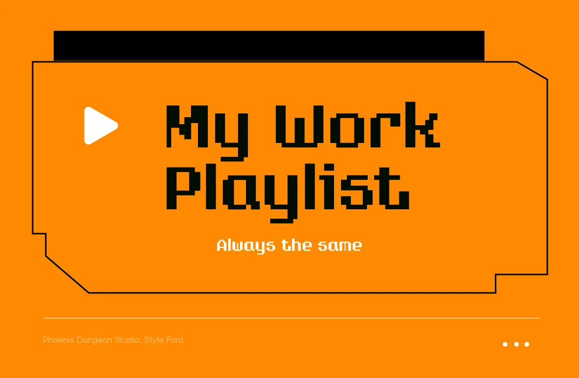
There's also a practical benefit. Because pixel fonts are drawn on a strict grid, they can match the resolution of the art. A pixel-art game with a smooth vector font in its menu often feels like two different projects stitched together. Matching the type to the pixel density of the art is one of the fastest ways to make an interface feel like it belongs.
We explained why this category is worth taking seriously in why we focus on pixel fonts. In games, that seriousness shows up as legibility.
The Five Things That Decide Readability
1. Scale in whole steps. A pixel font is designed on a grid, and it looks sharpest when each grid square lands on a whole number of screen pixels. In practice, render your text at the designed size or at clean multiples of it, and scale the whole game canvas in integer steps rather than by fractions. Fractional scaling is the most common reason pixel text looks smeared or uneven.
2. Contrast beats decoration. Text needs to stand apart from what's behind it. Dark text on a light panel, or light text on a dark panel, is the safest choice. When text sits directly on a busy game scene, add a solid outline or a drop shadow, and keep it consistent across the whole game.
3. Size for the smallest screen you support. A font that looks great on a monitor can be a strain on a handheld or a TV across the room. Decide the minimum comfortable size for your target device, then test on that device instead of assuming.
4. Short lines, generous spacing. Long paragraphs in pixel type get tiring fast. Keep dialogue lines short, break text into small boxes and give lines enough space that letters don't collide.
5. Consistency. Use the same font, size and color logic for the same kind of information everywhere. Players learn interface patterns quickly, and a stable pattern means they read less and understand more.
Different Jobs, Different Fonts
Most games need more than one text style. A title screen, a dialogue box, a HUD and a shop menu are asking different things of a typeface. Here's how we'd think about matching fonts to those jobs.
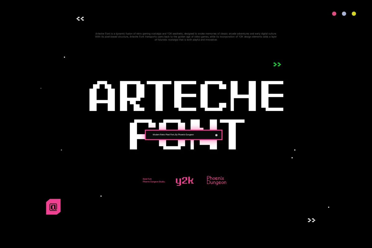
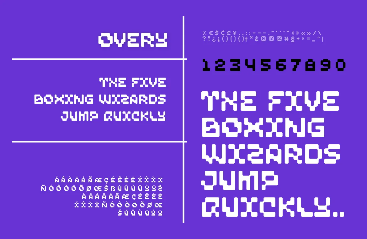
Titles and logos. This is where you can afford personality. Arteche is a bold, 8-bit-inspired display face built for arcade energy and retro-tech branding, with one heavy weight and maximum impact. Overy is a chunky, rounded pixel display face for bold headlines and arcade-style branding, available in Regular and Italic.
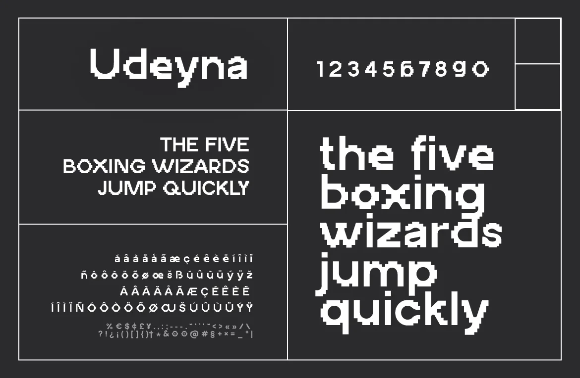
Friendly interfaces and characters. Udeyna is a playful pixel display face with distinctive, rounded character shapes, and it fits game interfaces, app branding and anything that needs a fun digital voice. It's a good match for cozy games, casual mobile titles and characters with a lot of personality.
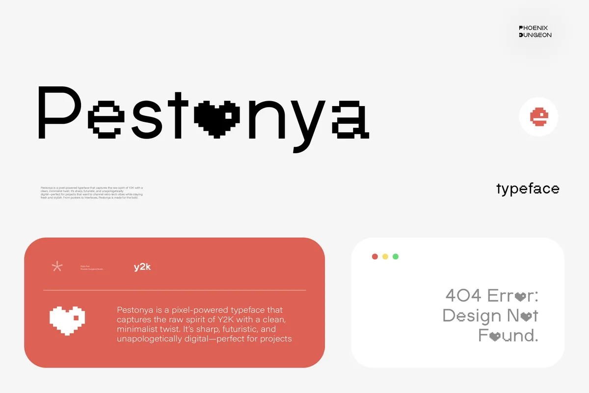
Systems with hierarchy. A game with menus, stats, item descriptions and tooltips needs a family with range. Pestonya comes in four full weights, from clean Regular to punchy Bold Italic, with a sharp, futuristic edge. That range lets you separate headings, labels and emphasized values without adding a second typeface.
A practical rule: use a display face for the moments you want players to feel something, and a calmer, more restrained setup for the moments they need to read something.
Common Mistakes in Game Typography
Using the display font for everything. A bold title face is wonderful for a logo and exhausting for a full inventory screen. Reserve it for short, prominent text.
Ignoring numbers. Health, damage, currency and timers get read constantly and quickly. Check that every digit is distinct at your smallest size, especially the pairs that tend to look alike.
Testing only on your own monitor. Text that looks perfect at your desk can fail on a TV, a handheld or a phone. Test where your players will actually play.
Stacking effects. An outline, a shadow, a glow and a gradient all at once turns a clean pixel grid into visual noise. One clear treatment is usually enough.
Forgetting non-English text. If you plan to localize, check that the font has the characters your target languages need before you commit to it. It's much easier to catch this early than after the UI is built.
Which License Do You Need for a Game?
This is the part developers ask about most, so it's worth being direct. A game that ships to players usually embeds the font inside the game files. That is not the same as using a font in a website or a trailer, and it needs its own tier.
At Phoenix Dungeon, the App & Digital Product tier covers embedding a font in a software app or digital product distributed to end users. Our FAQ confirms that games fall under this tier or higher. It also includes everything below it, so the same license covers your logo, store page, social posts and paid ads for the game. It doesn't cover broadcast or film use, such as a TV commercial.
If you only need the font for the game's website or promotional art and not inside the game itself, a lower tier may be enough. We walk through every tier in our guide to pixel font licenses, and the exact rights and price for each tier appear on every font's page. Prices change, so check the font page for the current one.
A Pre-Ship Readability Checklist
Before a build goes to players, run through the text in your game once, screen by screen, with these questions:
— Can I read every line at arm's length on the smallest device we support?
— Do the numbers stay distinct: health, currency, timers, damage?
— Is the contrast still fine on the brightest and darkest scenes in the game?
— Does any text sit on a background that changes, such as animated water or particles?
— Does the longest dialogue line fit its box without touching the edges?
— If the game is localized, do all the target languages fit and display correctly?
— Is the same kind of information always shown in the same style?
The value of doing this in one pass is that inconsistencies show up quickly. A menu that uses a different size from every other menu, or a warning that's harder to read than a tooltip, stands out when you look at everything together.
It also helps to watch someone else play. A new player will hesitate at the exact points where the interface text isn't doing its job, and that hesitation is far more reliable feedback than your own opinion of your own UI.
Frequently Asked Questions
What's the best pixel font for an indie game?
It depends on the job. A display face like Arteche or Overy suits titles, Udeyna suits friendly interfaces, and a family with multiple weights like Pestonya suits systems with a lot of menus. Many games use two fonts: one for personality and one for reading.
Do pixel fonts hurt readability?
Not when they're used at the right size and scale. Well-made pixel fonts are often very clear at the sizes they were designed for. Problems usually come from fractional scaling, low contrast or using a display face for long text.
Can I use a pixel font that isn't matched to my art's pixel size?
You can, but it often looks slightly off. If your art is drawn on a low-resolution grid, text set on a much finer or coarser grid can feel disconnected. Matching pixel density is a quick win.
Do I need a license for a free game?
Distributing a game to players with a font embedded is still a distribution, whether the game costs money or not. Check the license terms for your situation, and email license@phoenixdungeon.com if it isn't clear.
The Short Version
Match the font to the art, scale in whole steps, protect contrast, test on the real device, and use different fonts for feeling and for reading. Then buy the license that covers shipping the game. To compare fonts for your project, browse the full catalog.
Related Articles
All articlesOct 13, 2026Pixel Fonts
Why Pixel Fonts. The Honest Answer Is Less Interesting Than You'd Think.
No dramatic origin story, no calling. Just why pixel fonts became the one thing at Phoenix Dungeon worth building around, and why that's enough.
Read more
Oct 9, 2026Y2K
Y2K Fonts: How to Use Pixel Type for a Y2K Look
Y2K design borrows more from early interfaces than from pixels alone. Here's how to use pixel type for a Y2K look that feels current, not like a costume.
Read more
Oct 2, 2026Licensing
Pixel Font Licenses Explained: Which License Do You Actually Need?
Desktop, Web Font, Merchandise, App and more: our nine license tiers explained in plain English, so you buy the one you need and nothing you don't.
Read more