Insight
Articles.
12 articles
Oct 30, 2026Web Design
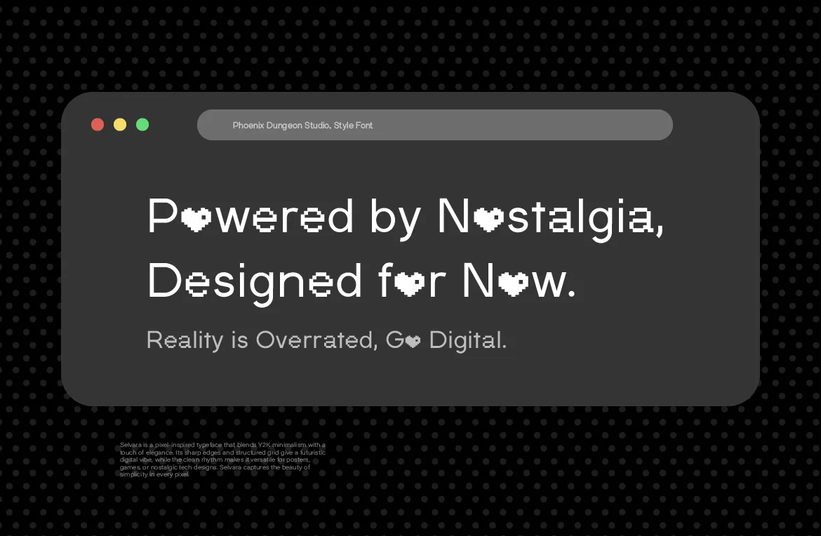
How to Use Pixel Fonts on a Website Without Hurting Readability
A pixel font can look crisp or blurry on the web depending on sizing and setup. Practical steps for sizes, formats and readability so pixel type stays sharp.
Read more
Oct 27, 2026Naming & Branding

Why Phoenix Dungeon? The Name Has a Story Nobody Asked For. Here It Is Anyway.
A username from 2018, a rejected name called Phoenix Group, and a logo a 19-year-old made that still hasn't changed. The real story behind the name.
Read more
Oct 23, 2026Typography Basics
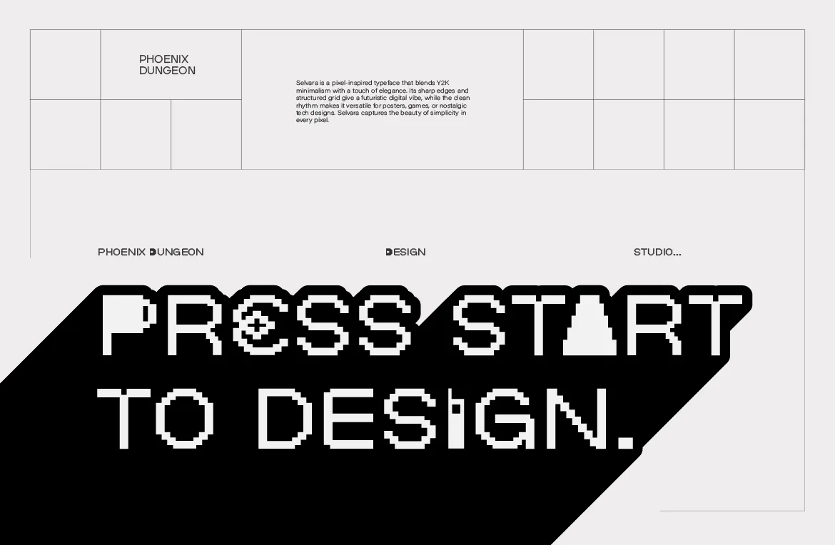
When to Use a Pixel Font (and When Not To)
Pixel fonts are powerful and easy to misuse. A straight-talking guide to when a pixel font is the right call, and when another typeface will serve you better.
Read more
Oct 20, 2026Pixel Fonts
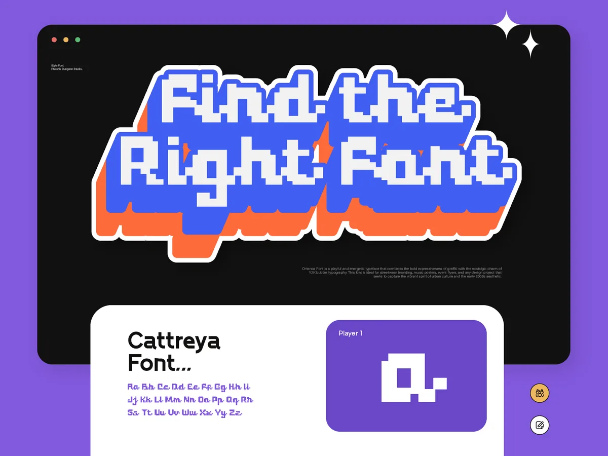
Pixel Fonts Have Always Fit Everywhere. Designers Just Forgot to Notice.
From government interfaces to streetwear lookbooks, pixel fonts have done a different job in every era. Why the category fits more than its reputation suggests.
Read more
Oct 16, 2026Game Design
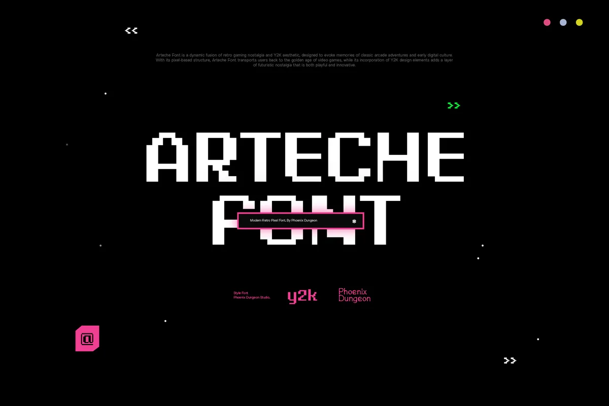
Pixel Fonts for Indie Game UI: What Actually Stays Readable
Pixel type can make a game interface feel cohesive or quietly unusable. What keeps menus, dialogue and HUDs readable, and which license covers a shipped game.
Read more
Oct 13, 2026Pixel Fonts
Why Pixel Fonts. The Honest Answer Is Less Interesting Than You'd Think.
No dramatic origin story, no calling. Just why pixel fonts became the one thing at Phoenix Dungeon worth building around, and why that's enough.
Read more
Oct 9, 2026Y2K

Y2K Fonts: How to Use Pixel Type for a Y2K Look
Y2K design borrows more from early interfaces than from pixels alone. Here's how to use pixel type for a Y2K look that feels current, not like a costume.
Read more
Oct 6, 2026Founder Story

I Made a Font Every Day for a Year. Here's What It Did to Me.
Twenty-five fonts a month through 2023 and 2024, including one named after the woman I love that never sold. What that stretch of daily font-making did to me.
Read more
Oct 2, 2026Licensing
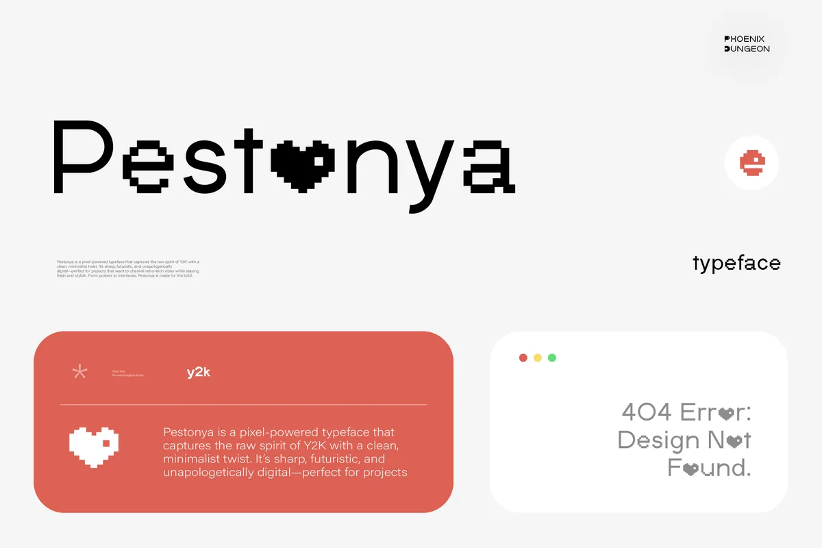
Pixel Font Licenses Explained: Which License Do You Actually Need?
Desktop, Web Font, Merchandise, App and more: our nine license tiers explained in plain English, so you buy the one you need and nothing you don't.
Read more