October 20, 2026
Pixel Fonts Have Always Fit Everywhere. Designers Just Forgot to Notice.
From government interfaces to streetwear lookbooks, pixel fonts have done a different job in every era. Why the category fits more than its reputation suggests.
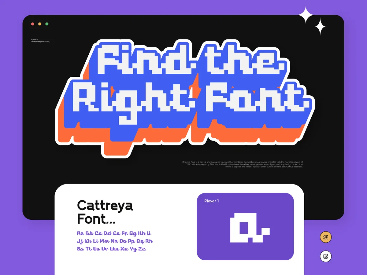
There is a common assumption about pixel fonts that sounds reasonable until you actually think about it.
The assumption is that pixel fonts belong somewhere specific. That they have a natural home, whether that's retro gaming, lo-fi aesthetics, nostalgia-driven branding, or Y2K revival work, and that outside of those contexts, they're a stylistic stretch. A deliberate provocation. Something you do when you want to signal that you're being unconventional.
I want to push back on that. Not because the association is wrong, but because it's incomplete in a way that undersells what pixel fonts actually are and what they can do.
The Rule Designers Already Broke
Before we talk about pixel fonts specifically, let's talk about something that's become completely normal in contemporary design: streetwear paired with script fonts.
If you described this combination to a typography purist ten or fifteen years ago, they would have had concerns. Script fonts carry a weight of romance, elegance, formality. They belong on wedding invitations, perfume packaging, restaurant menus. Streetwear is the opposite of all of those things. It's rough, urban, built for movement, not elegance.
And yet. Walk through any city, open any fashion brand's Instagram, browse any independent clothing label that knows what it's doing, and you will see script fonts on hoodies, on cargo pants, on the kind of clothing that has never been near a wedding invitation in its life. And it works. Not despite the contrast but partly because of it. The tension between the script's softness and the garment's edge creates something that neither element would have on its own.
Designers figured this out not by following rules but by ignoring them in the right way.
Pixel fonts are next. Or rather, they always were. The design world is just catching up to what was already true.
Every Era Gave Pixel Fonts a Different Job
Here is something worth sitting with: pixel fonts have been present across more contexts than almost any other type category, and in each context they've meant something completely different.
There was an era when pixel fonts were the fonts of official documentation. Early computing interfaces had no choice but to render type in pixels, which meant that the most serious, functional, professional text you could produce on a screen looked like what we now call pixel fonts. Government systems, medical records, banking interfaces. The pixel grid was not an aesthetic choice. It was a technical constraint. But the work it was doing was entirely serious.
Then came the gaming era. Pixel fonts became the visual language of interactive entertainment. RPG dialogue boxes, platformer title screens, score displays. In this context they carried excitement, play, imagination. Completely different from the documentation era, same underlying visual language.
Then came the nostalgia era. Pixel fonts became about memory. About the specific feeling of sitting in front of a CRT screen as a child, of a particular moment in personal or cultural history. They stopped being functional and became emotional shorthand for an entire generation's relationship with technology.
And now. Now they're in streetwear lookbooks and independent brand identities and music packaging and website design and places that have nothing to do with any of the previous eras. Not because designers are being nostalgic, but because the aesthetic has been fully absorbed into the broader visual vocabulary and can be deployed on its own terms, separate from what it used to mean.
Three entirely different meanings across three entirely different eras. Same visual DNA. Different jobs every time.
That is not a category with a limited range. That is a category that adapts.
What Makes Pixel Fonts Actually Work Everywhere
The honest answer is constraints.
Pixel fonts are built on a grid. Every decision about shape, weight, spacing happens within the limits of what the grid allows. And constraints, when they're real constraints rather than arbitrary ones, tend to produce work that has internal consistency. Everything in a pixel font comes from the same system of decisions. The letters belong together in a way that sometimes doesn't happen when you have infinite freedom.
That internal consistency is what makes them read clearly even in unexpected contexts. When you put a pixel font on a luxury packaging concept, the contrast is obvious and intentional, but the font itself doesn't fight the context. It holds its own character while sitting next to something completely different. That's harder to do than it sounds.
The other thing is specificity. A pixel font doesn't try to disappear into a design the way a neutral sans-serif does. It announces itself. It has a point of view. And in a design landscape where the safe choice is increasingly invisible, something that announces itself is actually useful.
There's also something worth saying about legibility. The assumption is that pixel fonts sacrifice readability for character. In practice, when the font is actually well made, the opposite is often true. Because every pixel placement is a conscious decision inside a tight constraint, good pixel fonts tend to be extremely clear at the sizes they're designed for. The grid forces clarity in a way that more freeform type doesn't always achieve.
This is why a website built around a pixel font can work. Not as a gimmick or a throwback, but as a genuine identity choice that says something about the brand before a single word of copy is read. The font is doing communication work before the content starts.
The Combination Nobody Expects
Street style with pixel font.
I keep coming back to this combination because it shouldn't make sense on paper and yet it does almost every time.
Street style is raw, physical, built around movement and cultural specificity. Pixel fonts are geometric, grid-based, built around digital constraints. The two worlds don't have an obvious relationship.
But put them together and something interesting happens. The pixel font brings a kind of precision to the rawness of streetwear. The streetwear context gives the pixel font an edge it doesn't always carry in other settings. The combination produces a tension that feels current in a way that either element alone doesn't.
This is exactly the kind of cross-context usage that defines where design is right now. The categories that used to separate different aesthetics are dissolving. The designers who are doing the most interesting work are the ones who stopped asking whether something is supposed to go together and started asking whether it actually works.
Pixel fonts pass that test in a surprising number of contexts. More than their reputation suggests.
Why This Matters for How We Make Fonts
At Phoenix Dungeon, this is part of why the pixel font focus makes sense beyond just being the category we're most interested in.
If we were making fonts for one specific use case, we'd be making something fragile. Something that works in gaming but nowhere else, or works in nostalgia branding but looks out of place in anything contemporary. That's a product with a ceiling.
But pixel fonts, when they're made well, when the underlying craft is solid and the character is genuine, travel. They work in contexts their creator didn't anticipate. A font we design with streetwear in mind might end up in a tech brand's identity. A font we design with gaming nostalgia in mind might end up on a restaurant menu that wants a specific kind of edge.
We can't predict where our fonts will end up. That's actually a feature, not a limitation.
What we can control is the quality of the underlying craft. Making sure that the fonts we put out are solid enough that when a designer puts them somewhere unexpected, they hold up. They don't look out of place. They bring their character with them and make the combination work.
That's what we're building toward. Fonts that are specific enough to have a voice and versatile enough to travel.
If you want to see what that looks like in practice, Overy and Arteche are probably the clearest examples of where we are right now. And if you want more context on why we ended up focusing here, we've written about that.
The short version: pixel fonts always fit everywhere. We're just trying to make the best versions of them.
Related Articles
All articlesOct 16, 2026Game Design
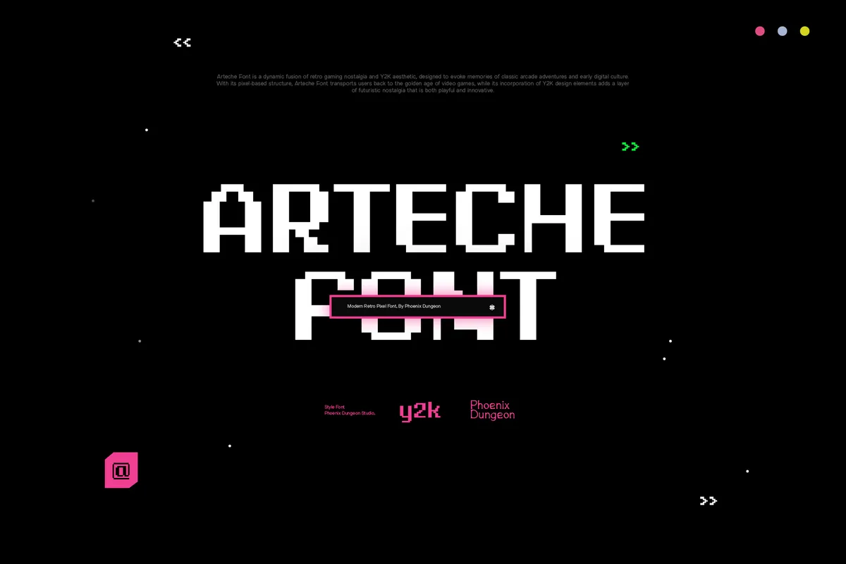
Pixel Fonts for Indie Game UI: What Actually Stays Readable
Pixel type can make a game interface feel cohesive or quietly unusable. What keeps menus, dialogue and HUDs readable, and which license covers a shipped game.
Read more
Oct 13, 2026Pixel Fonts
Why Pixel Fonts. The Honest Answer Is Less Interesting Than You'd Think.
No dramatic origin story, no calling. Just why pixel fonts became the one thing at Phoenix Dungeon worth building around, and why that's enough.
Read more
Oct 9, 2026Y2K
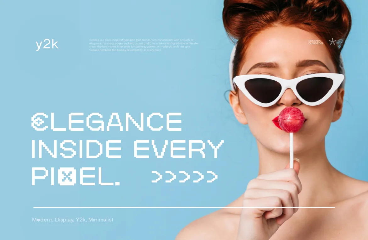
Y2K Fonts: How to Use Pixel Type for a Y2K Look
Y2K design borrows more from early interfaces than from pixels alone. Here's how to use pixel type for a Y2K look that feels current, not like a costume.
Read more