October 27, 2026
Why Phoenix Dungeon? The Name Has a Story Nobody Asked For. Here It Is Anyway.
A username from 2018, a rejected name called Phoenix Group, and a logo a 19-year-old made that still hasn't changed. The real story behind the name.
Most brand names have a story that the founder never tells publicly. Sometimes because it's boring. Sometimes because it's embarrassing. Sometimes because the real answer doesn't sound as strategic as the one they've been giving in interviews.
This one is none of those things. It's just personal in a way that I never really had a reason to write down until now.
Before It Was a Studio, It Was Just My Name
Somewhere around 2018, when I started college, I needed a username.
This sounds trivial. It wasn't. If you've grown up in Indonesia with a common name, you understand the problem immediately. Alif is not a rare name. There are a lot of us. In college alone, there were enough Alifs in enough places that the name alone wasn't enough to tell anyone anything about which one you meant.
So I did what a lot of people do. I added something to it.
I added Phoenix.
Alief Phoenix. That was my LINE ID. My social media handles. My username in every design group I was part of in college, every forum, every platform where I was starting to show up as someone who made things. The word Phoenix just felt right for reasons I couldn't fully articulate at the time. Something about it sounded like what I wanted to be, persistent, returning, not the kind of thing that stays down.
It stuck. Not because I forced it, but because people started using it. A friend told me once that he was talking to someone else about being in class with me, and the other person asked which Alif. He said "alif phoenix" and the other person immediately knew exactly who he meant.
That's a strange thing to experience. Having a word become the thing that makes you findable in a sea of people with your own name. But that's what happened. Phoenix wasn't a brand yet. It was just how people knew me.
Phoenix Group. And Why It Didn't Work.
When I decided to turn this into something more formal, a name for a creative business, the first instinct was the obvious one.
Phoenix Group.
Clean, professional-sounding, carried the word I was already known by. I thought it worked.
A friend disagreed. Directly and without much softening. He told me it was generic, that it had no real identity, that it sounded like the name of a holding company that could be selling anything from insurance to construction. He was right. And the .com was already taken, which was its own problem.
I've thought about that criticism a lot since then. Not because it hurt, but because it was completely accurate. Phoenix Group said the word I wanted but said nothing else. It had no character. No edge. No reason to exist as a specific thing rather than a placeholder.
So I went looking for something better.
How You Find a Name at Nineteen
The process was not scientific.
I was nineteen, maybe twenty. I knew I wanted to keep Phoenix because Phoenix was already me. I knew I needed something after it that would make the combination specific, memorable, and available as a .com domain. Those were my only real criteria, and honestly the .com part might have been the most important one.
I am, and have always been, somewhat obsessed with domain names. Every business I've started has had to have a clean .com. Not a .net, not a .co, not a creative extension that requires explaining. A proper .com that you can say out loud and have someone find without spelling it. This is not a negotiable thing for me.
So I was looking for a word that went with Phoenix, sounded right, felt like it fit the space I was in, which at the time was digital design assets, and had a .com available.
Phoenix Dungeon came to me the way a lot of good names come to you when you're young and you haven't overthought it yet. It just surfaced and immediately felt correct. Something about the contrast of it. Phoenix is mythological, hopeful, about return and fire and rising. Dungeon is underground, contained, secretive, where difficult things happen in the dark. Together they suggested a place where something is being forged. A creative space that takes the work seriously, that has some edge to it.
For a studio selling design assets, it made sense in a way I couldn't fully explain but could immediately feel.
And phoenixdungeon.com was available.
That was it. Decision made.
The Logo That a Nineteen Year Old Made
Here's the part I still think about.
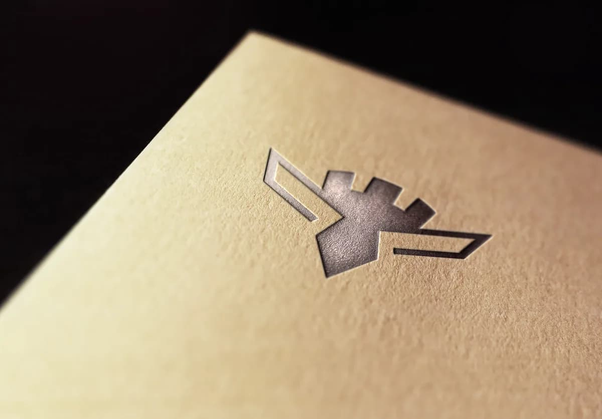
The Phoenix Dungeon logo has only ever had two versions. The first version was made quickly, just to have something to put somewhere, the kind of placeholder you create because you need a logo now and you'll fix it later.
A few months after that, I made the current one.
I was nineteen or twenty years old. I had been designing seriously for maybe a year or two. I did not have the experience or the body of work that I have now, and I certainly did not have the perspective that comes from spending years in the industry looking at what holds up and what doesn't.
And yet. Every month now, I make logos for clients as part of the design work I do. I've made dozens of them at this point, across different categories, different styles, different levels of complexity. I know what goes into a logo that actually works, what makes something feel solid and considered versus something that looks fine today and feels dated in six months.
When I look at the Phoenix Dungeon logo, I'm still surprised by it. Not in a performative way. Genuinely surprised. The thing holds up. It's well crafted in a way that I'm not sure I would have predicted from a version of myself that young. There's something to it that feels complete, considered, like it knows what it is.
I don't take full credit for that. Part of it is luck, the kind of luck that comes from making something before you know enough to second-guess every decision. Sometimes not knowing what you're doing produces better results than knowing too much, because you don't talk yourself out of the thing that actually works.
But I'm proud of it. The nineteen year old version of me made something that the current version of me still wouldn't change. That doesn't happen as often as you'd think.
What the Name Means Now
Phoenix Dungeon has been through a lot of versions of itself since 2018.
It started as a general design asset studio. It became a font foundry. It grew to 150 fonts and then had to reckon with what that actually meant, which we wrote about honestly in an earlier piece. It's now in the middle of becoming something more specific, a studio that makes pixel fonts and takes them seriously as the primary thing rather than one category among many.
But through all of those versions, the name has stayed the same. And I think that's because the name was never really about what the studio was selling. It was about who was running it.
Phoenix is still the word that makes me findable. Still the word people attach to my name when they need to distinguish me from the other Alifs. Still the word I chose at nineteen because it felt like what I wanted to be.
Dungeon is still the right word for the kind of work I want to do. Not public-facing, not trying to be impressive, just serious work happening in a contained space where the craft is the point.
Phoenix Dungeon. A place where something is being made by someone who cares about making it.
That's been true since 2018. It's still true now. The products changed. The focus changed. The name never needed to.
If you want to see what's being made in the dungeon right now, the shop is the place. And if pixel fonts are something you've been looking for, Selvara and Cattreya are probably the best place to start understanding where we're going.
Related Articles
All articlesOct 13, 2026Pixel Fonts
Why Pixel Fonts. The Honest Answer Is Less Interesting Than You'd Think.
No dramatic origin story, no calling. Just why pixel fonts became the one thing at Phoenix Dungeon worth building around, and why that's enough.
Read more
Oct 6, 2026Founder Story
I Made a Font Every Day for a Year. Here's What It Did to Me.
Twenty-five fonts a month through 2023 and 2024, including one named after the woman I love that never sold. What that stretch of daily font-making did to me.
Read more
Sep 29, 2026Font Business

Lucky and Unlucky: The Honest Truth About Why Some Font Studios Win and Others Don't
One font made hundreds a month. My 150 fonts made less than $400. The honest truth about timing, momentum, and why some font studios win.
Read more