November 6, 2026
What to Pair With a Pixel Font: 7 Combinations That Actually Work
A pixel font rarely works alone. Seven tested pairings, from neutral sans to monospace and serif, and how to choose the one that fits your project.
Almost every good pixel font layout has a second typeface in it. You just don't notice it, because its job is to be quiet. The pixel font takes the headline, the logo or the price tag, and something calmer carries everything else.
Choosing that second typeface is where a lot of projects go wrong. The pixel font gets all the attention during the design process, and the companion gets picked in thirty seconds from whatever is already installed. This guide covers why pairing matters so much for pixel type, seven combinations that hold up in real projects, and a simple way to test a pairing before you commit to it.
Why Pixel Fonts Almost Always Need a Partner
Pixel fonts are built on a grid, and that grid is what gives them their character. It's also what makes them tiring to read in long passages. Short, prominent text is where they shine: headlines, titles, labels, numbers, a single line on a poster. We went through the reasons in more detail in our guide on when to use a pixel font and when not to.
So a pixel font needs a partner for the same reason a lead singer needs a band. The partner handles the paragraphs, the captions, the product descriptions and the fine print. When the partner is well chosen, the pixel font looks more intentional, because it's clearly the one voice that's allowed to be loud.
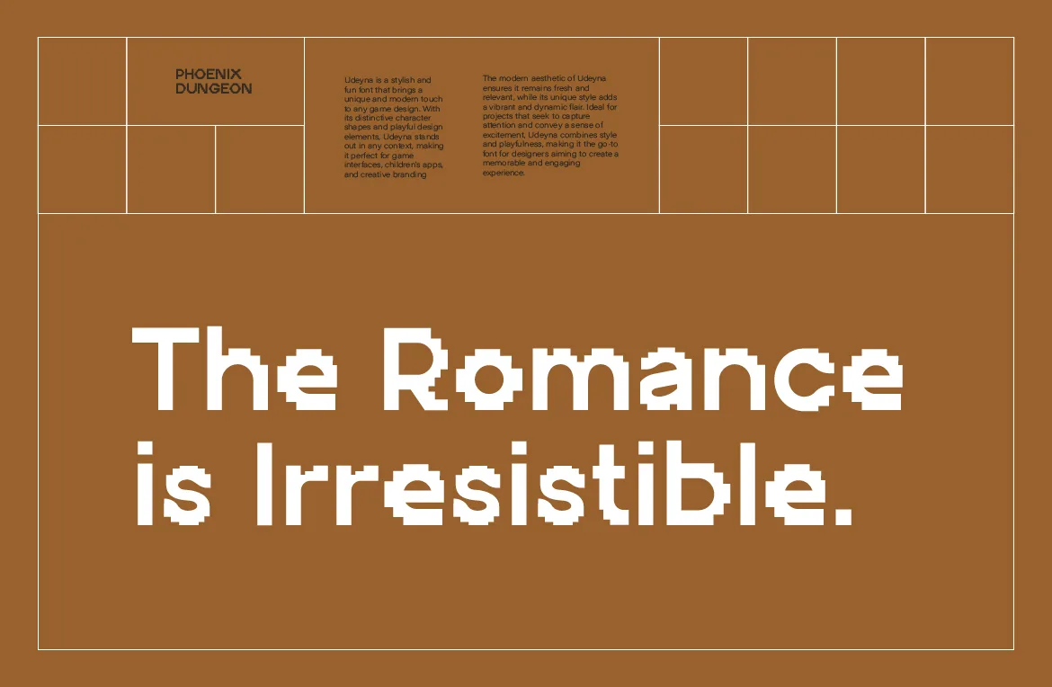
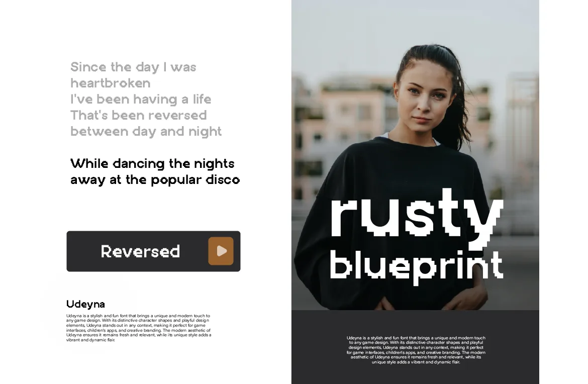
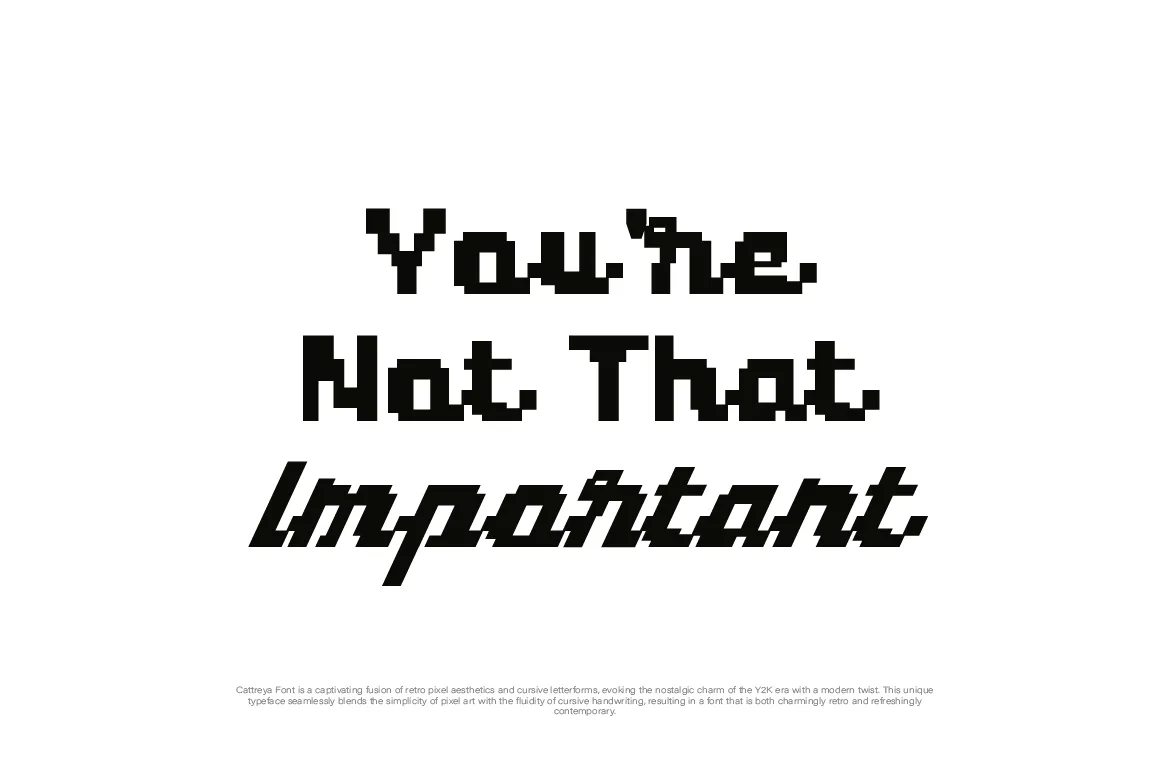
Most of our own fonts are single display styles. Arteche, Selvara and Udeyna each come in one style, and Overy and Cattreya come in Regular and Italic. They're made for display, not for a whole page of reading. That's not a limitation to work around; it's the reason pairing exists.
The One Rule: Contrast in Voice, Harmony in Proportion
Good pairings share something and differ in something. With pixel fonts, the difference is almost always built in: one typeface is made of squares and the other isn't. So the thing you need to look for is harmony.
Similar proportions. If the pixel font is wide and chunky, a condensed companion can feel mismatched. If the pixel font is narrow, a very wide sans-serif can make it look fragile.
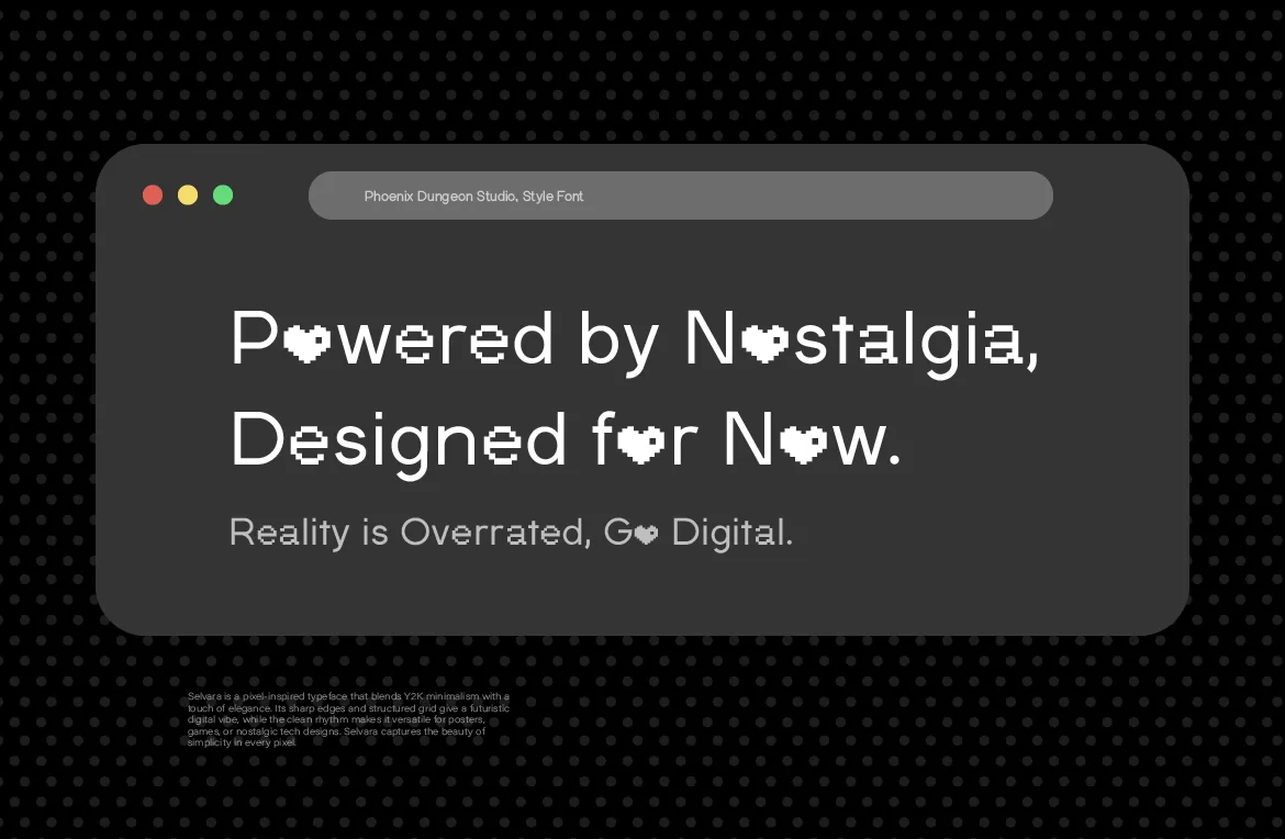
A similar temperature. Some typefaces feel warm and friendly, others cold and technical. A playful, rounded pixel face like Udeyna sits better next to a friendly sans than a severe one.
Clear roles. The companion should never compete. If you find yourself wanting to make the companion bold, large and colorful, the pairing isn't working, or the pixel font is on the wrong text.
7 Pixel Font Pairings That Actually Work
These are categories rather than a single "correct" font, because the right companion depends on the project. Where it helps, we name a widely available example so you can test the idea right away.
1. Pixel display + neutral grotesque sans. The safest pairing and often the best. A neutral sans-serif like Inter, Helvetica or Arial stays out of the way and lets the pixel font carry all the personality. This is the default for websites, apps and product pages, and it's the combination we'd reach for first with a bold face like Arteche.
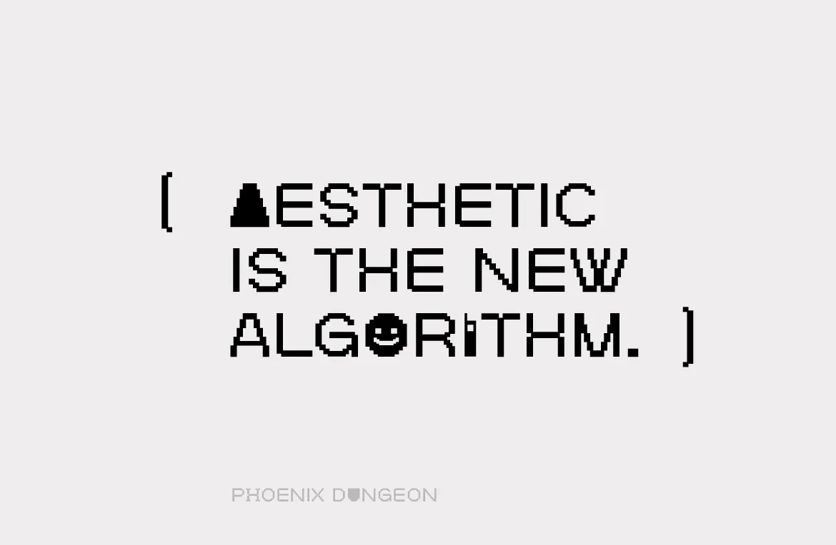
2. Pixel display + monospace. Monospace fonts carry a hint of computing history, so they feel related to pixel type without copying it. IBM Plex Mono or JetBrains Mono under a pixel headline gives a layout a clear "terminal" or "software" mood. Use it for captions, labels, specs and dates rather than long paragraphs, because monospace also slows reading down.
3. Pixel display + humanist sans. Humanist sans-serifs have a trace of handwriting in their shapes, which softens the grid. This works well with playful or friendly pixel faces, such as Udeyna in an app or a casual game. The result feels approachable instead of technical.
4. Pixel display + geometric sans. Geometric sans-serifs are built from circles and straight lines, so they share the pixel font's love of simple construction. The pairing feels clean and modern, a good match for tech branding and for the softer Y2K look of Selvara.
5. Pixel display + editorial serif. The most unexpected pairing, and one of the most striking. A classic serif for the body text next to a pixel headline creates a "digital meets print" tension that suits magazines, cultural projects and long-form websites. Keep the serif fairly plain so the contrast stays elegant rather than chaotic.
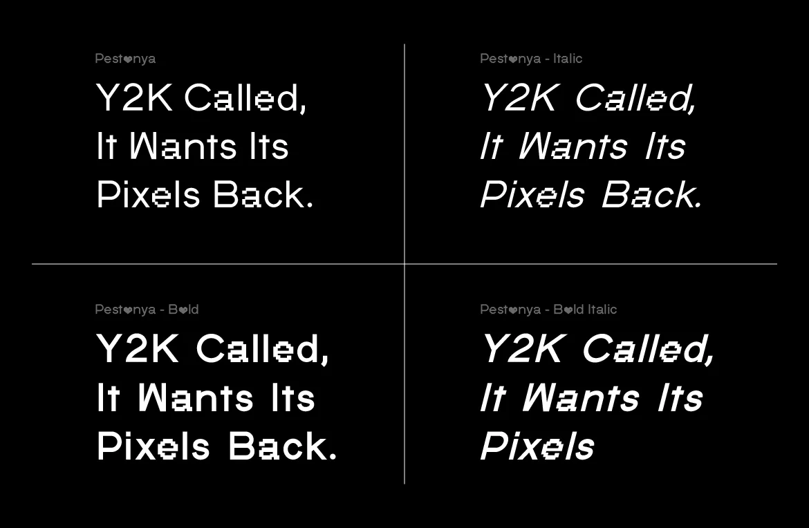
6. One pixel family, several weights. Sometimes the best partner is the same family. Pestonya comes in four styles, Regular, Italic, Bold and Bold Italic, which means you can build a whole hierarchy of headline, subhead and accent without adding a second pixel face. You'll still want a calm typeface for paragraphs, but the display side of the system stays perfectly consistent.
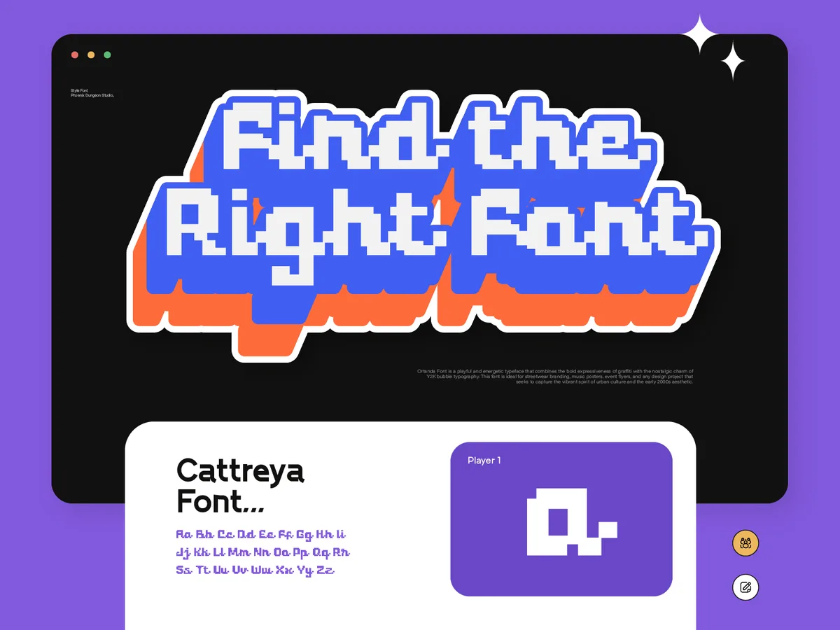
7. Pixel script + clean sans. A hybrid face like Cattreya, which pairs blocky pixel construction with flowing, connected letterforms, already has a lot going on. It needs the plainest possible companion. A simple sans-serif at a modest size lets the script do its job without the layout feeling crowded. Cattreya also has an Italic, so you can switch styles for emphasis without adding another typeface.
Pairings to Avoid
Two different pixel fonts at the same size. Two grid-based faces with different grids side by side usually look like a mistake. If you really want two pixel fonts, give them clearly different jobs and sizes, or stay within one family.
A pixel font with a decorative display face. A pixel headline and a brush-script subhead are both asking for attention. The page ends up with no clear hierarchy.
A thin, delicate body font. Very light weights next to a heavy pixel face can look washed out, especially on screens. Choose a regular weight with enough presence to hold its own.
Too many companions. One pixel face and one companion is a system. One pixel face and three companions is a collection. Most projects need exactly two typefaces.
How to Test a Pairing in Five Minutes
You don't need to design a whole project to know whether a pairing works. Set up one small test and look at it honestly.
Use real content. Take an actual headline and an actual paragraph from your project. Placeholder text hides problems, especially with pixel fonts, where specific letter combinations can look awkward.
Set the pixel font at its intended size. Pixel type looks crisper at some sizes than others. Our guide to using pixel fonts on the web explains why, but the short version is to test a few sizes and keep the one with the cleanest edges.
Squint at it. Blur your eyes and look at the page. You should see one clear loud element and one calm texture. If both blocks look equally heavy, adjust sizes or weights.
Check it small. Shrink the whole test down to a phone screen or a thumbnail. Good pairings still feel balanced at small sizes; weak ones fall apart.
Try the opposite. Swap the companion for one from a completely different category, for example serif instead of sans. Sometimes the unexpected option is the one that gives the project its personality.
Pairing by Project Type
Websites and apps: pixel display with a neutral or humanist sans. Readability comes first, and system-friendly sans-serifs load fast and render well.
Games: pixel display with a monospace or a clear sans for dialogue and settings. We covered what keeps game text readable in our indie game UI guide.
Streetwear and merch: pixel display with a condensed or neutral sans for size charts, care labels and product copy. There's more on this in our streetwear branding guide.
Y2K projects: pixel display with a geometric sans or a simple mono. Our Y2K guide goes deeper into building a small type system for that look.
Editorial and culture: pixel display with a plain serif, for that digital-meets-print contrast.
Frequently Asked Questions
What's the best font to pair with a pixel font?
For most projects, a neutral sans-serif. It's the lowest-risk choice and it lets the pixel font carry the personality. If you want more character, try a monospace for a technical mood or a serif for an editorial one.
Can I use a pixel font for body text?
For a line or two, yes. For full paragraphs, it usually becomes tiring to read. Pair it with a readable companion for anything longer.
Should the companion font be free?
It can be. Many excellent sans-serifs, monospace and serif families are open source. Just check the license of the companion as carefully as you check the pixel font's.
Does the pairing affect which license I need?
Each font has its own license. The pixel font's tier depends on how you use it: a website, social posts, a logo, merchandise and so on. Our license guide explains the tiers in plain English.
Do Phoenix Dungeon fonts have alternate characters or ligatures?
Our fonts focus on a complete, consistent character set with kerning rather than stylistic alternates. If you want variety within one family, Pestonya's four styles or the Italic of Overy and Cattreya are the way to get it.
The Short Version
Give the pixel font the loud job and pick a companion whose only job is to be calm. Start with a neutral sans, test with real content, squint, shrink it down, and trust the result. If you're still choosing the pixel side of the pair, the full catalog shows every font with real sample text.
Related Articles
All articlesOct 30, 2026Web Design
How to Use Pixel Fonts on a Website Without Hurting Readability
A pixel font can look crisp or blurry on the web depending on sizing and setup. Practical steps for sizes, formats and readability so pixel type stays sharp.
Read more
Oct 23, 2026Typography Basics
When to Use a Pixel Font (and When Not To)
Pixel fonts are powerful and easy to misuse. A straight-talking guide to when a pixel font is the right call, and when another typeface will serve you better.
Read more
Oct 20, 2026Pixel Fonts
Pixel Fonts Have Always Fit Everywhere. Designers Just Forgot to Notice.
From government interfaces to streetwear lookbooks, pixel fonts have done a different job in every era. Why the category fits more than its reputation suggests.
Read more