November 13, 2026
How to Use Pixel Fonts in Canva, Figma and Photoshop (Without Them Going Blurry)
Installing a pixel font is easy. Keeping it crisp in Canva, Figma and Photoshop is not. A practical setup guide, plus the licensing question most people skip.
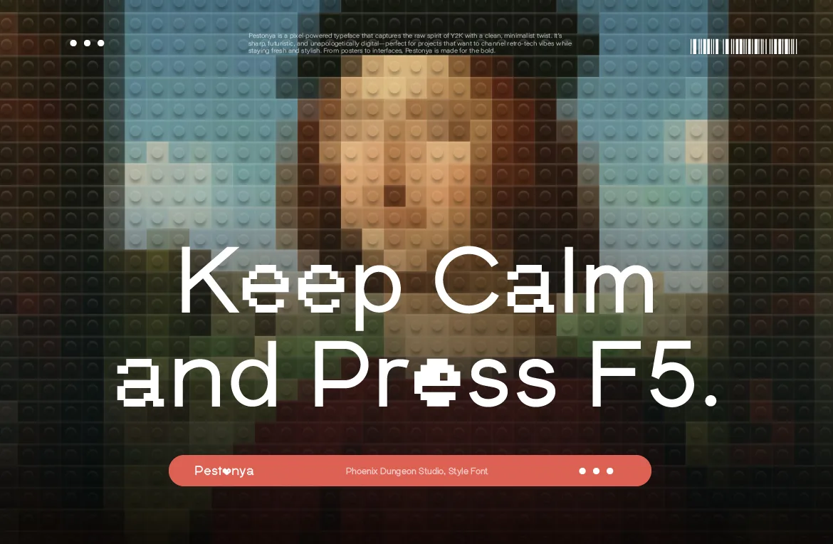
You bought a pixel font, installed it, typed your headline, and the edges look soft. It's one of the most common frustrations with pixel type, and it almost never means the font is broken. It usually means the tool is doing exactly what it was built to do: smoothing text so ordinary fonts look good.
This guide walks through getting a pixel font into Canva, Figma and Photoshop, the settings that keep it crisp in each one, and a licensing detail that matters more than most people realize when a font goes into a cloud tool.
Why Pixel Fonts Go Blurry in Design Tools
Design tools render text with anti-aliasing. They blend the edges of each letter with the background so curves look smooth instead of jagged. For a normal typeface, that's exactly what you want.
A pixel font is different. Its edges are supposed to be sharp steps. When a tool places those steps between two screen pixels, it has to blend them, and the letters come out soft. Three things make this more likely:
Off-grid sizes. Every pixel font has sizes where its grid lines up cleanly with the screen and sizes where it doesn't.
Fractional positions. A text box sitting at x = 120.5 instead of x = 120 can soften every letter in it.
Scaling after the fact. Resizing a text layer by dragging, or exporting at a size different from the design, can move the grid off whole pixels.
Our fonts are drawn as vector outlines with pixel construction, and the size of one "pixel" differs between families. So rather than memorizing a magic number, get used to testing a few sizes and keeping the crispest one. We explain the web side of this in our guide to pixel fonts on websites.
Step 1: Install the Right File
Every Phoenix Dungeon purchase includes OTF, TTF, WOFF and WOFF2 files. For design tools on your own computer, install the OTF (or the TTF if a tool has trouble with OTF). WOFF and WOFF2 are for websites, not desktop apps.
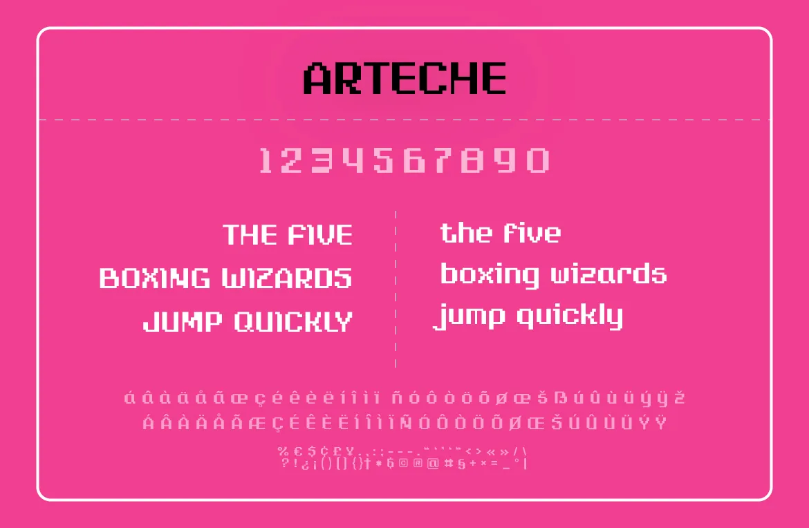
If the family has more than one style, install every style you plan to use. Pestonya has four files, Regular, Italic, Bold and Bold Italic; Overy and Cattreya have Regular and Italic. Many tools can't fake a missing bold or italic properly, and if they do, the result won't match the real design.
After installing, restart the design app so it picks up the new font. Then check the full character set before you design with it: accented letters, numbers and currency symbols. Our fonts cover Western European languages and the $ ¢ £ ¥ € symbols, but not Cyrillic, Greek or Vietnamese, for example. It's better to find that out now than after a layout is finished.
Photoshop: Turn Off Anti-Aliasing
Photoshop gives you the most control, because it lets you choose how text is anti-aliased. With a text layer selected, look for the anti-aliasing menu in the options bar or at the bottom of the Character panel. It usually offers None, Sharp, Crisp, Strong and Smooth.
Choose None for crisp pixel edges. The letters will render as hard steps. At the right size, this gives the cleanest possible result.
Work at 100% zoom. Judge sharpness at actual size. At other zoom levels, Photoshop shows you a resampled preview that can look softer or sharper than the real file.
Avoid free-transform scaling on text. Change the font size in the Character panel instead of dragging the layer's corners, so the size stays a whole number.
Snap to whole pixels. Keep text layers at whole-pixel positions. Moving layers with the arrow keys helps, since each press moves exactly one pixel.
Figma: Keep Everything on the Pixel Grid
Figma doesn't offer an anti-aliasing switch, so the fix is about positioning and size.
Use the desktop app or the font installer. In the Figma desktop app, fonts installed on your computer show up automatically. In the browser, you need Figma's font installer running so the web app can see your local fonts.
Turn on pixel snapping. Figma has a "Snap to pixel grid" option in its view settings. With it on, frames and text boxes stay at whole-pixel positions.
Check your frame positions too. A text box can be at a whole number inside a frame that itself sits at a fraction. Check the parent frames if text still looks soft.
Export at 1x or clean multiples. Exporting at 2x or 3x keeps the grid clean. Odd scales such as 1.5x can soften edges.
Canva: Work Big, Export Big
Canva is the most limited of the three, because it doesn't let you change how text is rendered. You can still get good results.
Custom fonts need a paid plan. Uploading your own fonts is a Brand Kit feature available on paid plans such as Canva Pro, and on Canva's Enterprise, Education and Nonprofit programs. Canva accepts OTF, TTF and WOFF, and asks you to confirm you have the rights to use the font before it uploads.
Upload each style separately. If you want Bold or Italic, upload those files too. Otherwise the bold and italic buttons stay unavailable or the text won't match the real design.
Make the pixel text large. Pixel fonts hold up far better at headline sizes. Keep small text in a regular companion typeface.
Download at a larger size. If your plan allows it, scale the download up so there are more pixels per letter. Larger exports hide rendering softness much better than small ones.
Uploading Fonts to Cloud Tools: Read This First
Installing a font on your own computer and uploading it to a cloud service are different things. When you upload a font to a Canva Brand Kit or to Figma's shared organization fonts, a copy of the font file is stored on someone else's servers, and in a team account it becomes available to everyone in that workspace.
Our license doesn't allow sharing font files with third parties outside your licensed project team, and each license covers up to five users in the same organization. Uploading to a cloud tool can cross both of those lines without anyone intending it to. So before you upload a Phoenix Dungeon font to a cloud design tool, email license@phoenixdungeon.com with your setup and team size. We'll tell you honestly what's covered and what you'd need.
Using the font in the desktop apps on your own licensed machines doesn't raise this question. And whatever tool you design in, the tier still depends on the finished use: social posts, ads, a logo, merchandise and so on. Our license guide walks through each tier.
A Quick Troubleshooting Checklist
Edges look soft: try a few sizes a couple of points apart, check for fractional positions, and export at 1x or a clean multiple.
The font doesn't appear: restart the app after installing. In Figma's browser version, make sure the font installer is running.
Bold or italic looks wrong: install or upload the real style files instead of relying on the tool's fake bold or italic.
Letters are missing or replaced: the character may not be in the font. Check the character set for your language or symbol.
It looked sharp on screen but soft in the export: the export size or scale is different from your design size. Match them.
If you design for clients, it's worth building this checklist into your handoff too. Working on someone else's brief brings its own pressures, something we wrote about honestly in designing for yourself versus designing for clients.
Frequently Asked Questions
Why does my pixel font look blurry in Canva?
Canva smooths text for normal fonts and doesn't let you switch that off. Use the pixel font large, keep small text in a companion typeface, and download at a bigger size.
Can I use a pixel font in Figma in the browser?
Yes, as long as Figma's font installer is running on your computer so the browser can access your installed fonts. The desktop app does this automatically.
Which anti-aliasing setting should I use in Photoshop?
None, for crisp pixel edges. Then fine-tune the font size until the letters look clean at 100% zoom.
Which file format should I install?
OTF for design apps, with TTF as a fallback. WOFF and WOFF2 are for websites.
Can I upload a Phoenix Dungeon font to my team's Canva or Figma account?
Email us first. Cloud uploads can share the file beyond your licensed team, which the license doesn't cover by default. We'll tell you what fits your setup.
The Short Version
Install the OTF, turn anti-aliasing off where you can, keep text on whole pixels, test a few sizes, and export at clean scales. Check with us before a font goes into a shared cloud workspace. If you haven't picked your pixel font yet, every font page in the catalog lets you type your own text before you buy.
Related Articles
All articlesNov 6, 2026Font Pairing
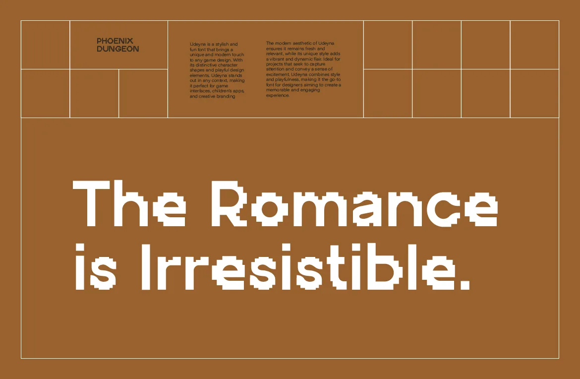
What to Pair With a Pixel Font: 7 Combinations That Actually Work
A pixel font rarely works alone. Seven tested pairings, from neutral sans to monospace and serif, and how to choose the one that fits your project.
Read more
Oct 30, 2026Web Design
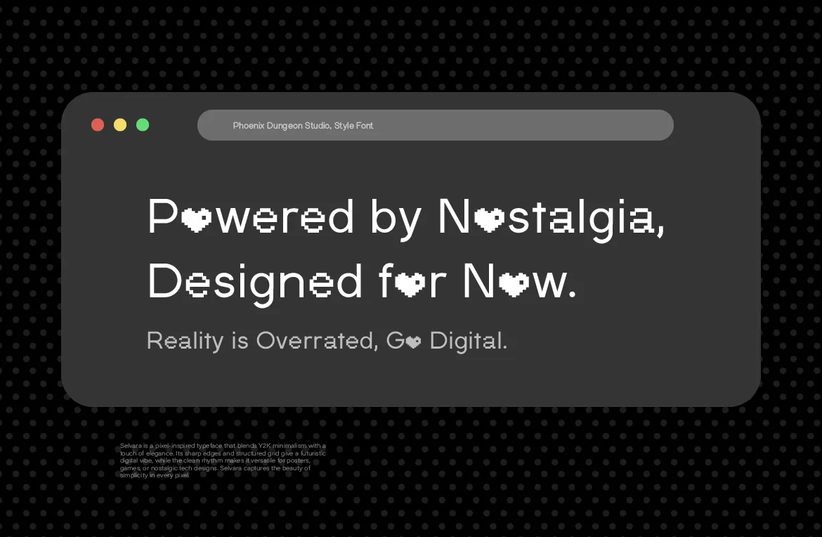
How to Use Pixel Fonts on a Website Without Hurting Readability
A pixel font can look crisp or blurry on the web depending on sizing and setup. Practical steps for sizes, formats and readability so pixel type stays sharp.
Read more
Oct 23, 2026Typography Basics
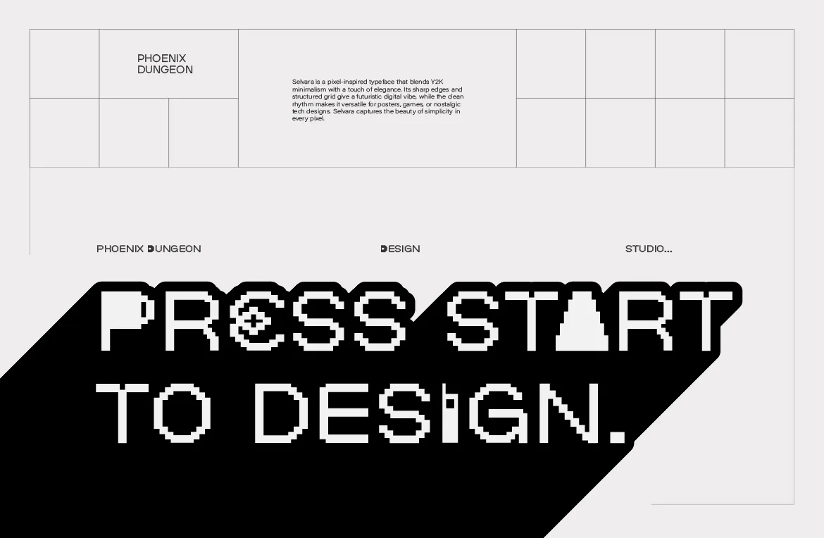
When to Use a Pixel Font (and When Not To)
Pixel fonts are powerful and easy to misuse. A straight-talking guide to when a pixel font is the right call, and when another typeface will serve you better.
Read more