November 20, 2026
Pixel Fonts for Holiday and New Year Designs That Don't Look Cheap
Pixel type can make holiday and New Year graphics feel warm and nostalgic, or like a free template. How to design seasonal work that looks considered.
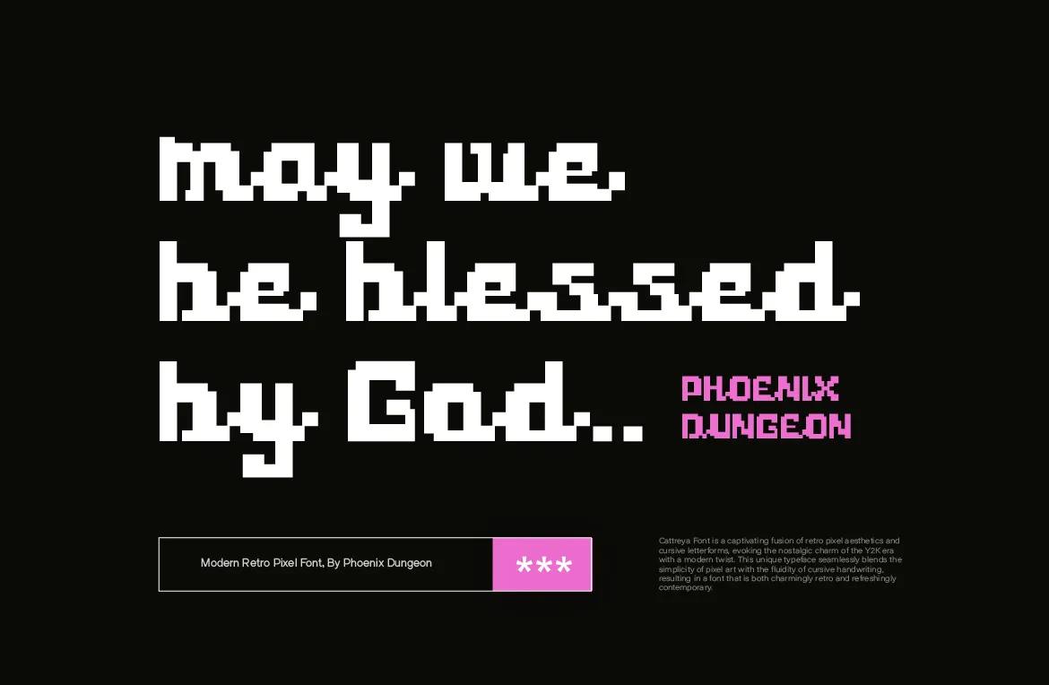
Every December, the same thing happens. Brands and designers need a holiday post, a New Year countdown, a greeting card or a year-end sale banner, usually by yesterday. And a lot of that work ends up looking like the same free template with the same glitter and the same script font.
Pixel type is a good way out of that. It carries warmth and nostalgia, it reminds people of old games, early computers and the countdown clocks of past New Years, and it still looks deliberate. But seasonal design is also where pixel fonts get pushed too far. This guide covers how to use pixel type for holiday and New Year work that feels considered, not cheap.
Why Pixel Type Works for the Holidays
Nostalgia is the whole mood. The end of the year is when people look back. Pixel type carries memory by default: first consoles, old greeting e-cards, the digital clock counting down to midnight. You don't need to explain the reference; people feel it.
It stands out in a crowded feed. In December, social feeds fill up with elegant scripts and gold serifs. A clean pixel headline breaks the pattern without being loud.
It suits countdowns and numbers. Dates, times and big numerals like 2027 look natural in pixel type, because digital displays showed numbers exactly this way for decades.
What Makes Seasonal Design Look Cheap
Before talking about what to do, it helps to name what goes wrong.
Every holiday symbol at once. Snowflakes, stars, ornaments, confetti, sparkles and a Santa hat on the first letter. Choose one or two.
Effects on effects. A pixel font already has texture. Adding glow, gold foil, a drop shadow and a bevel hides the grid that makes it interesting.
Too many typefaces. A holiday graphic with four fonts reads as a collage. One expressive face and one calm companion is enough.
Tiny pixel text. Pixel fonts are made for prominent text. Using one for the small print of a holiday sale makes the whole design harder to read.
Picking the Right Pixel Font for the Occasion
Different seasonal moods call for different fonts. Here's how we'd match our own.
Warm and personal: Cattreya. Its connected, flowing letterforms built on a pixel grid feel closer to handwriting than most pixel faces, which suits greeting cards, thank-you messages and anything that should feel personal. Its Italic gives you a second voice for a signature or a short note.
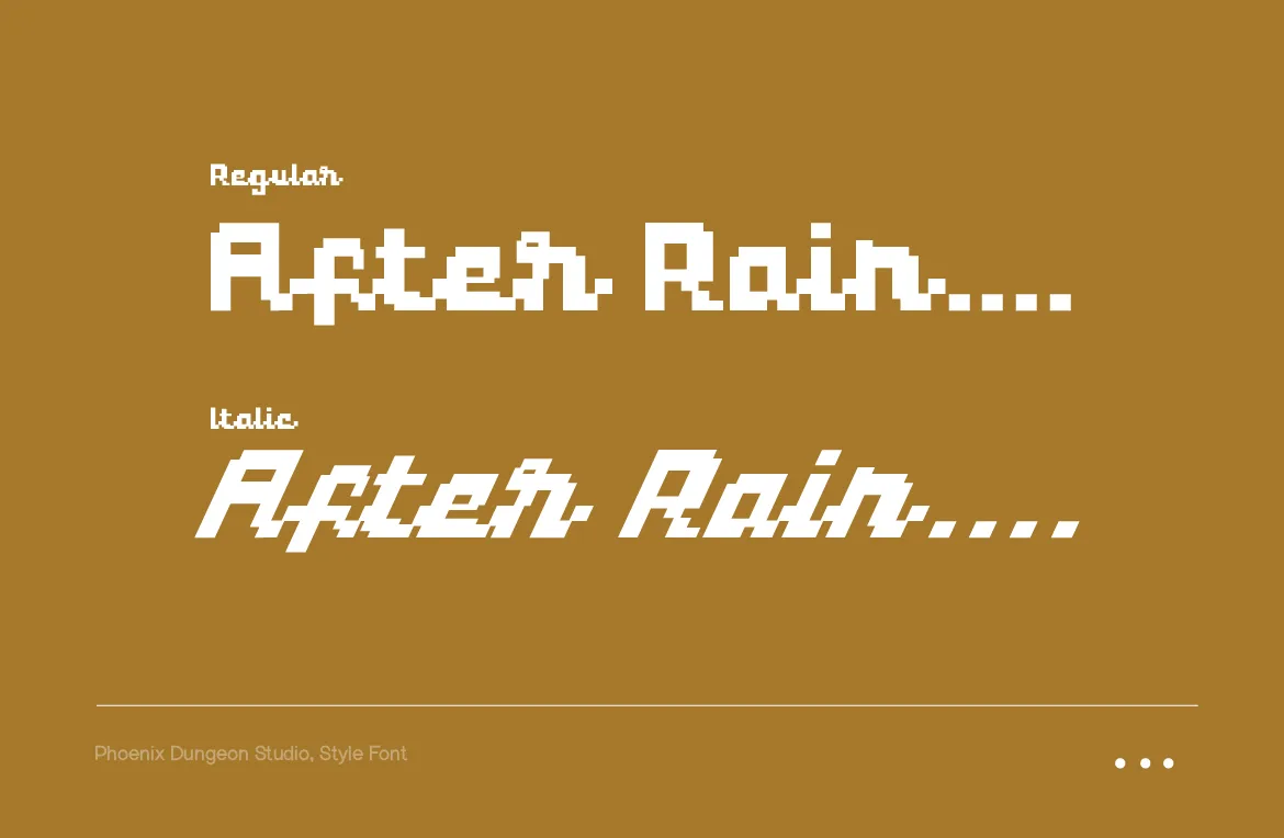
Countdown and New Year: Pestonya. A sharp, futuristic face with four styles, from Regular to Bold Italic. It's made for numbers, dates and the "the future starts now" energy of a New Year countdown, and the weights let you build a clear hierarchy from the big year number down to the time.
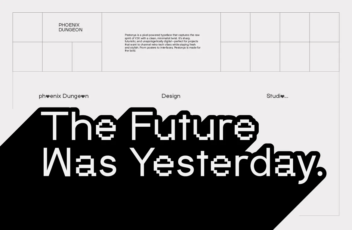
Party and celebration: Arteche. One heavy, 8-bit-inspired weight with arcade energy. It's the one for year-end parties, gaming communities and anything that should feel like a celebration rather than a quiet card.
Playful and friendly: Udeyna. Rounded, distinctive shapes with a fun digital voice. It suits kids' events, app holiday themes and brands with a light, friendly tone.
Five Ways to Keep It Looking Premium
1. Use a restrained palette. Choose two or three colors and stick to them. Deep green with warm cream, black with a single festive red, or navy with silver all look more expensive than a rainbow.
2. Let the type be the decoration. A large pixel headline is already a graphic. Many of the best seasonal pieces are just one line of well-set pixel type on a clean background.
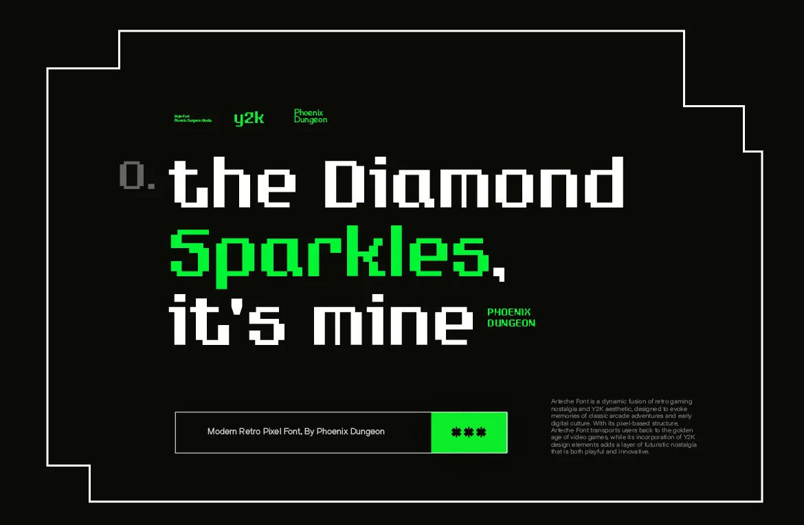
3. Give it space. Generous margins make a design feel calm and confident. Crowded holiday graphics feel rushed, even when they aren't.
4. Add one pixel-built element. A single pixel-drawn star, snowflake or firework that matches the font's grid ties everything together better than stock holiday clip art.
5. Pair it with a calm companion. Put the pixel font on the greeting and set dates, offers and details in a clean sans-serif. We covered seven reliable pairings in our pixel font pairing guide.
Greetings in Other Languages
If you're sending greetings to an international audience, check that the font has every character you need before you design. Our fonts cover Western European languages, so greetings like these work:
English: Merry Christmas, Happy New Year
Indonesian: Selamat Natal, Selamat Tahun Baru
Spanish: ¡Feliz Navidad!, Feliz Año Nuevo
French: Joyeux Noël, Bonne Année
German: Frohe Weihnachten, Frohes neues Jahr
Portuguese and Italian: Feliz Natal, Buon Natale
They don't currently cover languages like Polish, Czech, Turkish, Vietnamese, Russian or Greek. If a greeting needs characters the font doesn't have, set that line in a companion typeface that does, rather than letting the tool swap in a random fallback.
Which License Covers Holiday Work?
Seasonal projects cover a lot of different uses, so it's worth matching each one to the right tier.
Personal cards for friends and family: Desktop.
Holiday posts on your brand's social accounts: Social Media.
A paid year-end sale campaign: Digital Ads.
Greeting cards, calendars or prints you sell: Merchandise & Print.
A holiday campaign for a client: client work isn't covered by Desktop, so the tier depends on where the work will appear, social, ads or print.
Each tier includes everything below it, so buy the one that matches the biggest thing you'll do. Our license guide explains the full ladder.
Plan It Before December
The biggest reason holiday design looks cheap is time. Everything gets made in the last week. If you set your seasonal type system in November, one font, one companion, a palette and a few templates, December becomes a matter of changing words, not designing from scratch.
It's the same lesson that shows up in a lot of places: small, early decisions tend to hold up better than rushed big ones. We wrote about that from a very different angle in why several failed companies haven't worried us.
A Simple Seasonal Template Kit
If you post a lot in December, a small kit saves hours and keeps everything consistent. Here's a setup that works for most brands and creators:
One feed post template. A portrait format, such as 1080 by 1350 pixels for Instagram, with the pixel headline in the top half and a calm companion typeface for one line of detail below.
One story template. A vertical 1080 by 1920 layout with the headline in the upper third, so it stays clear of the app's buttons and captions at the bottom.
One countdown template. A big pixel numeral for "days left" and a small label. Change only the number each day. Pixel numerals look like a digital display, which makes a daily countdown feel like a real clock ticking down.
One sale banner. The offer in pixel type, the conditions in the companion typeface, and nothing else. Sale banners get cluttered fast; the template protects you from yourself.
One color rule. Decide in advance which color is for headlines, which for backgrounds and which for accents. It's the easiest way to make twenty posts feel like one campaign.
Build the kit at the exact sizes you'll post. Pixel fonts look crisper when the design isn't scaled after the fact, a point we covered for design apps in our Canva, Figma and Photoshop guide.
Frequently Asked Questions
Are pixel fonts good for Christmas designs?
Yes, especially if you want something nostalgic and warm instead of the usual elegant script. Keep the rest of the design restrained and let the type carry the mood.
What's the best pixel font for a New Year countdown?
A sharp face with good numerals and several weights, like Pestonya, works well. Test the exact digits of the year you're designing for, since numbers are the focus.
Can I use the same font for all my holiday posts?
You should. One consistent pixel font across all seasonal content makes it feel like a campaign rather than a series of one-offs.
Do I need a new license for each holiday campaign?
No. A license covers unlimited projects within its scope. If the scope grows, for example from social posts to printed cards for sale, move up to the tier that covers the new use.
The Short Version
Pick one pixel font that fits the mood, use a restrained palette, give the type space and resist adding every holiday effect. Plan it in November and December becomes easy. To find the right face for your season, browse the full catalog.
Related Articles
All articlesNov 13, 2026Design Tools
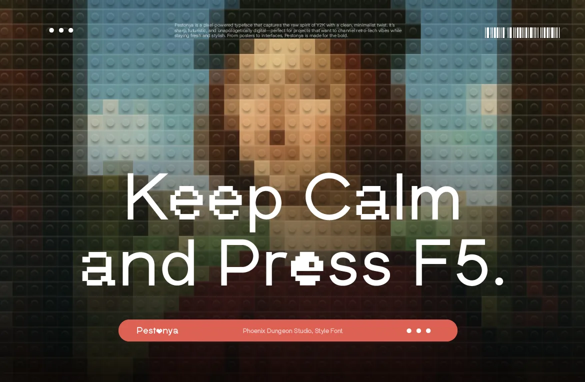
How to Use Pixel Fonts in Canva, Figma and Photoshop (Without Them Going Blurry)
Installing a pixel font is easy. Keeping it crisp in Canva, Figma and Photoshop is not. A practical setup guide, plus the licensing question most people skip.
Read more
Nov 6, 2026Font Pairing
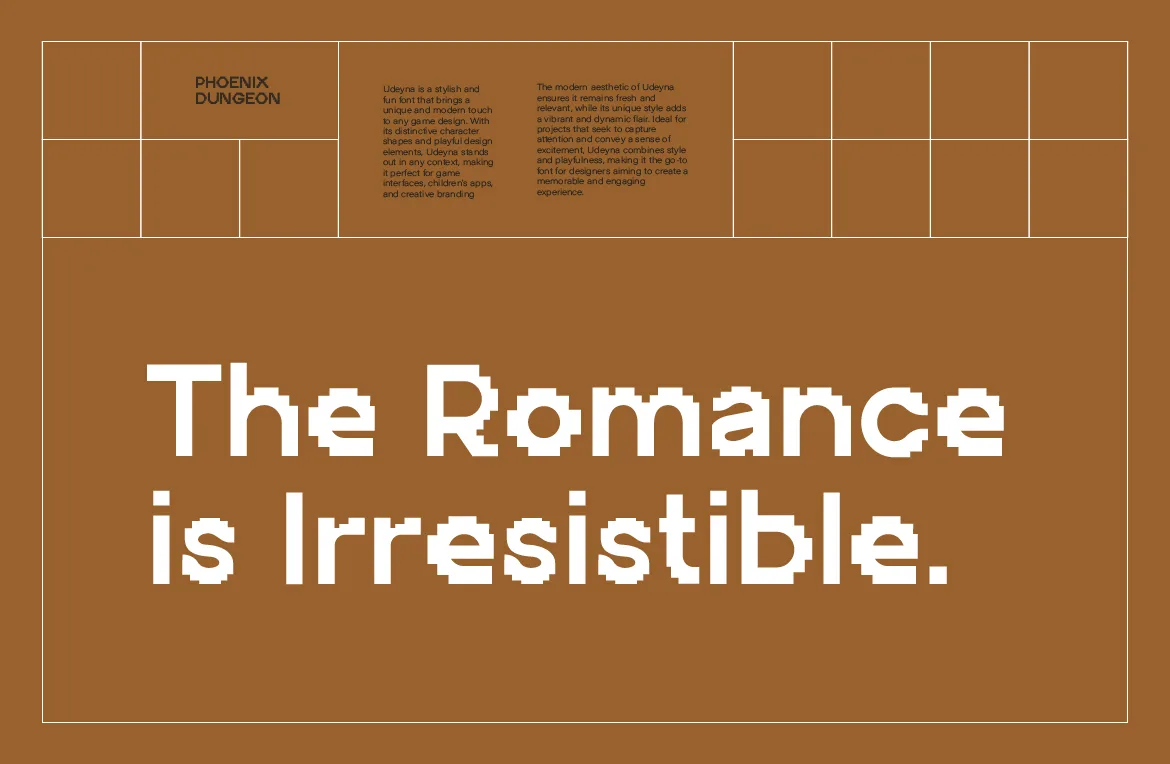
What to Pair With a Pixel Font: 7 Combinations That Actually Work
A pixel font rarely works alone. Seven tested pairings, from neutral sans to monospace and serif, and how to choose the one that fits your project.
Read more
Oct 30, 2026Web Design
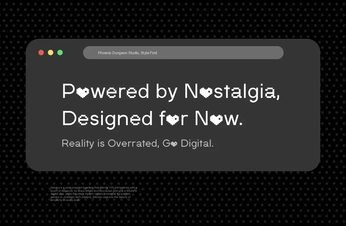
How to Use Pixel Fonts on a Website Without Hurting Readability
A pixel font can look crisp or blurry on the web depending on sizing and setup. Practical steps for sizes, formats and readability so pixel type stays sharp.
Read more